SMOG

Challenge
SMOG is a form of supported communication, and stands for Speaking with Gesture Support. When you SMOG, you speak and form gestures to key words at the same time. The gestures are derived from Flemish Sign Language. They are easy to form.
Branding
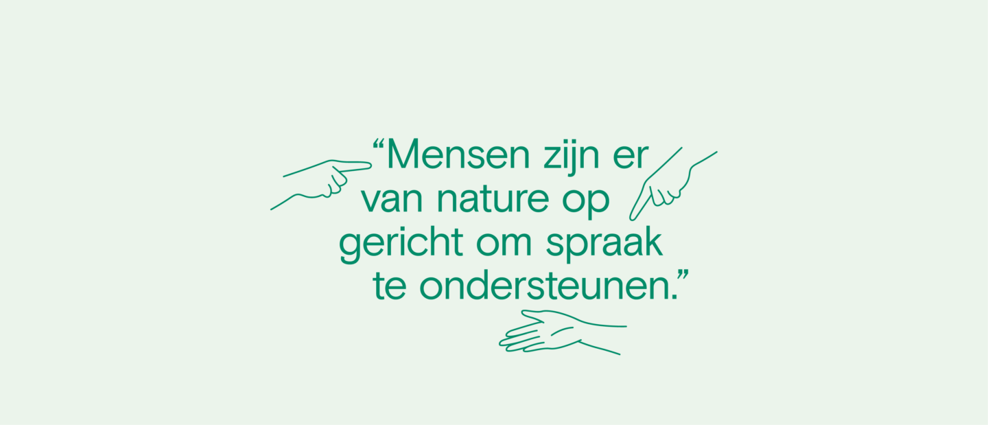
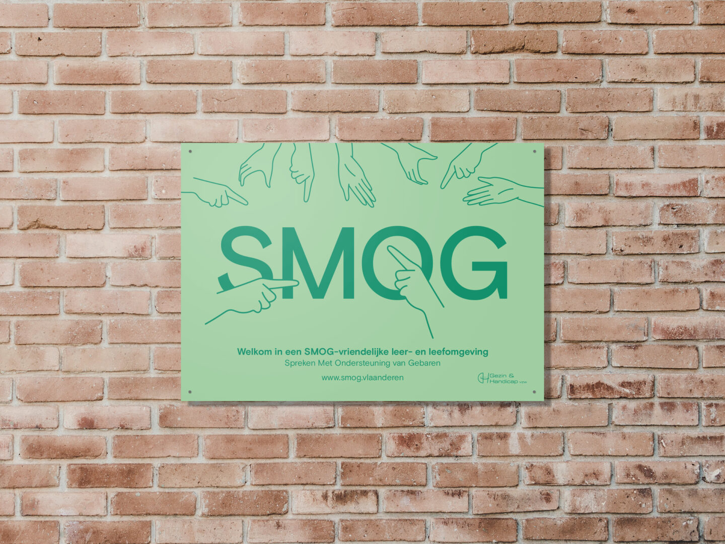
We drew inspiration from the many gestures that make communication possible. Hands open a conversation, we make that clear. So the hands literally define the shape of the logo. Our graphic designer drew several hands himself that reinforce the whole brand identity. They can be freely used to emphasize certain content.
With the three fresh colors, we want to appeal to the younger target groups. In addition, they immediately catch the eye. This recognizability was essential for SMOG, as the organization still too often remains under the radar. Finally, we chose a friendly but confident font that exudes clarity and clarity.
Brand book
The organization has members and volunteers all over Flanders. Thanks to a sophisticated brand book, every visual communication is clear to everyone. If your entire organization communicates in the same way, you are always recognizable.
Signage
A SMOG sign is now displayed on more than 2,000 facades. Schools, youth centers and practices thus make it clear that the gestures are known and used there. Greater visibility in the streets also increases awareness of SMOG.

Website and platform
The website is a giant, customized resource of information. You'll find everything you want to know about SMOG. You will learn gestures thanks to helpful videos, find SMOG therapists, discover how to use SMOG with babies ... We took into account the different audiences to make the website experience as simple as possible.
With around 600 videos and a protected client portal, the website also presented a technical challenge. Lots of power, lots of memory. So SMOG is accessible anytime and on any carrier.
The green design gives the website a fresh look and feel, while the hands add the necessary symbolism. Thanks to clear titles, we created structure and overview in the content. Quickly find the gestures? The UX is designed so that you have a call to action to the gestures on every page.

Videography in collaboration with Het Bataljon
Together with the videographers of The Battalion, we filmed about 100 gestures. Setting: a green background and orange clothing. In this way, the corporate identity is present everywhere. These are small details, but they make an incredible difference to the organization's recognizability.
