Manuus


Rebranding for a professional image
Every company goes through an evolution over the years. It was no different for Manuus. In 2023, Emiel decided to change tack and position himself more as a renovation partner. There was also a shift in the target group. For Manuus, the ideal customer is the Bank van Breda customer: someone who wants to give their (second) home a dream renovation, has the means to do so and is happy to outsource the entire project to an expert.
Logo and typography under the microscope
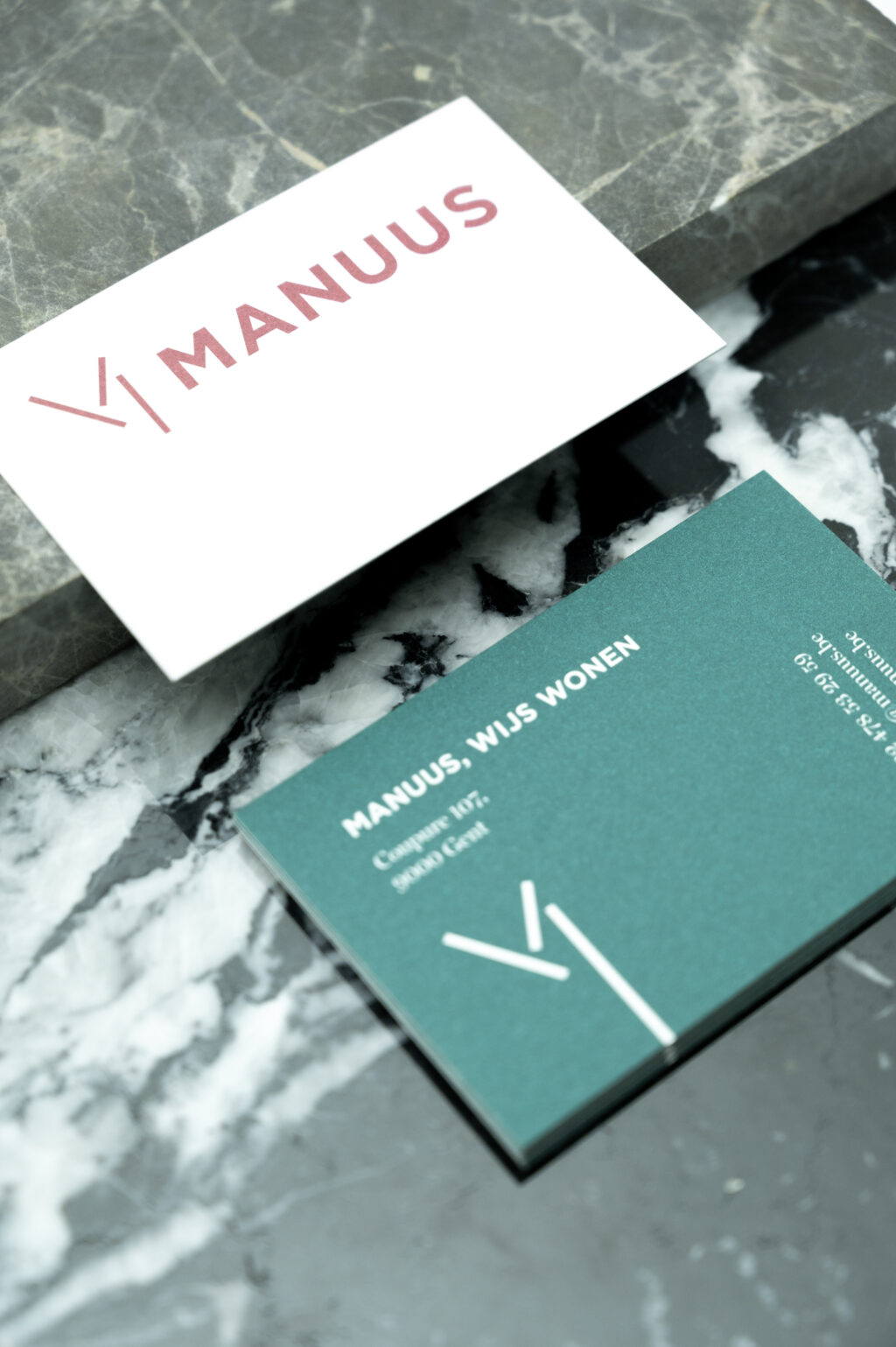
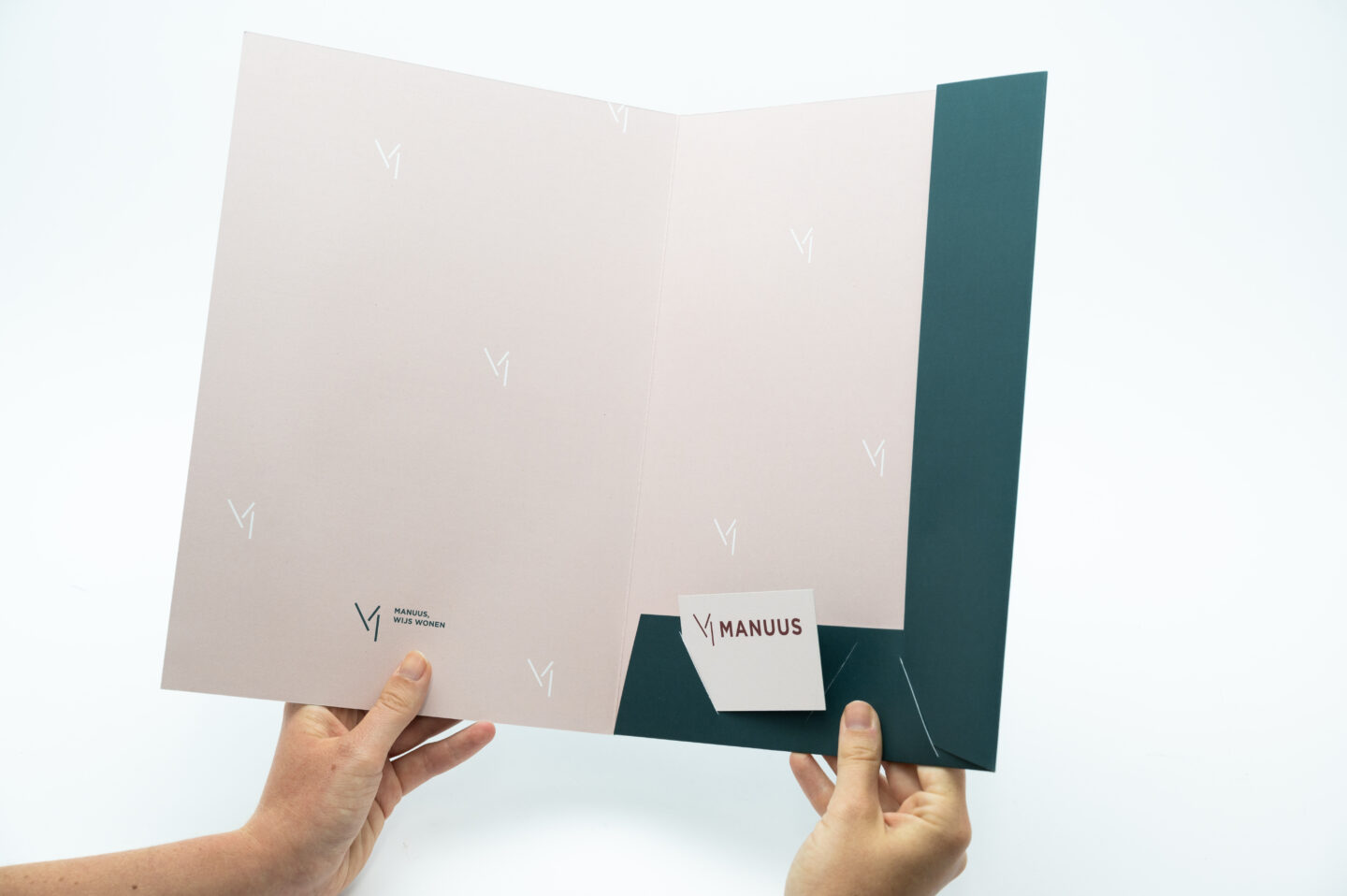
The existing logo and typo looked too young, too playful. We developed a rebranding that respected the original style, but exuded more luxury and seriousness. So the logo evolved into a sleeker, more timeless version of the 'M'. The house style also received an additional serif font. The branding gains more professionalism thanks to the refined typography.
New colours
The use of colour also strengthens your positioning. The bright pink and green from the previous house style gave way to two softer, warmer variants and a chic whole bordeaux.

The website highlights the partner role
Carefree renovating does not exist. Partners who bear the worry together with you do. That message should be read in a clear but polite way on the website. Furthermore, we consistently opt for a more formal tone of voice, in line with the target group's expectations.
Webdesign
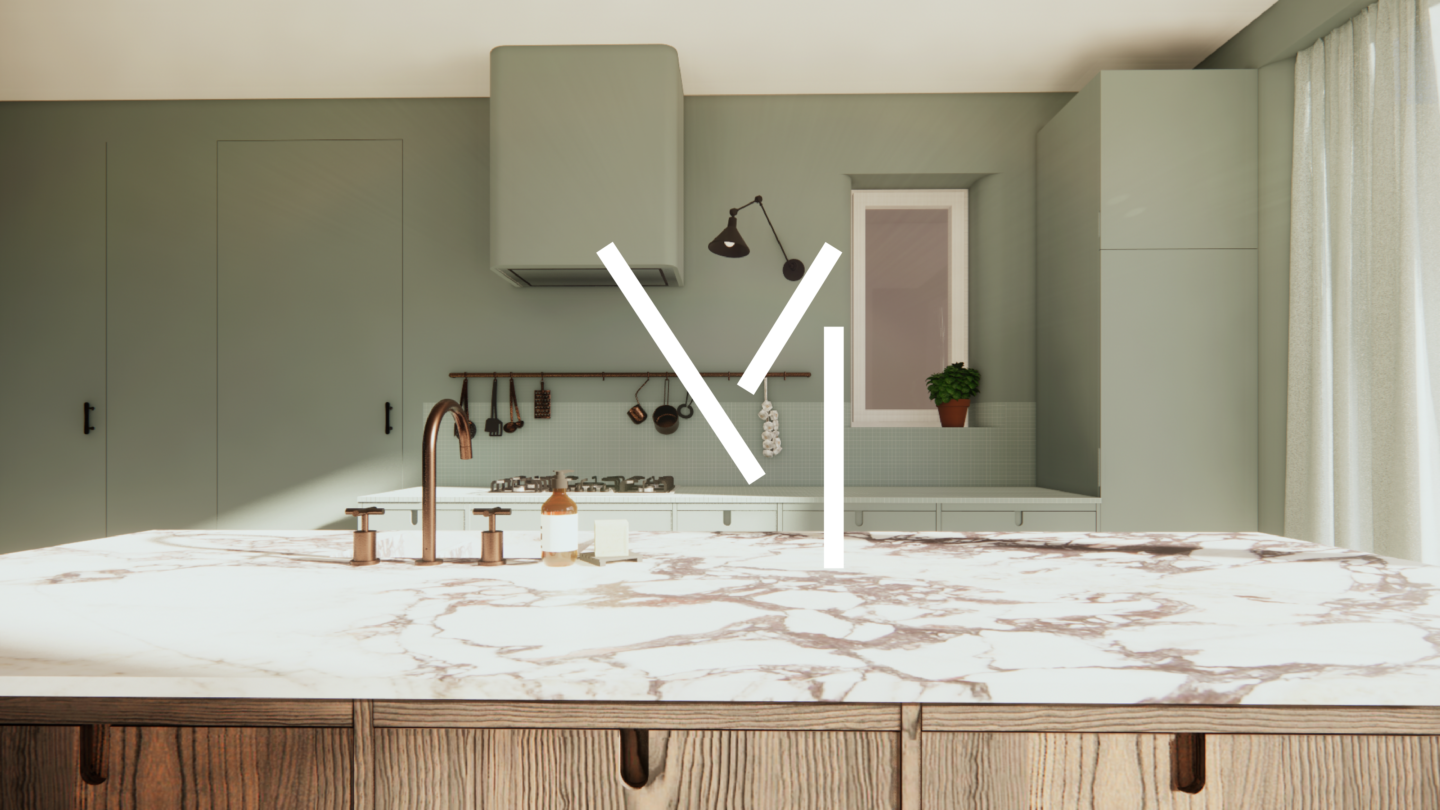
Finally, we translated the branding into an elegant, high-end web design. On the one hand, the website is an introduction to Manuus' promise as a partner and services. On the other hand, it also serves as an online portfolio where you can admire all the successful projects.
