Skinical
Name branding
Because 'centre for treatment and prevention of skin ageing' does not exactly roll off the tongue easily, the rejuvenation cure started with a name branding.
Skinical says it all: recognisable, cheerful, fresh, aesthetic, and medical knowledge.
Branding and corporate identity
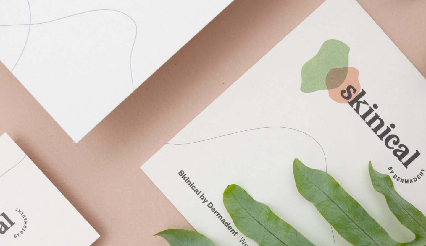
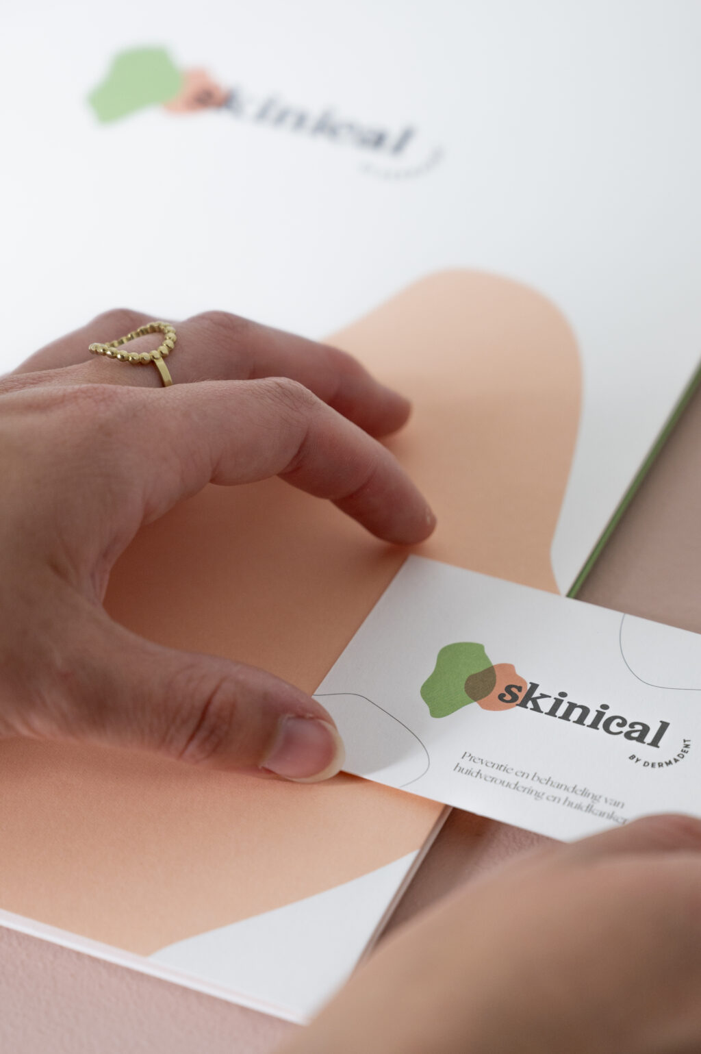
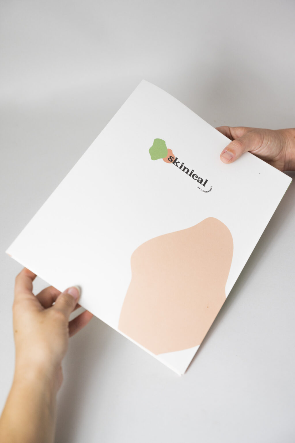
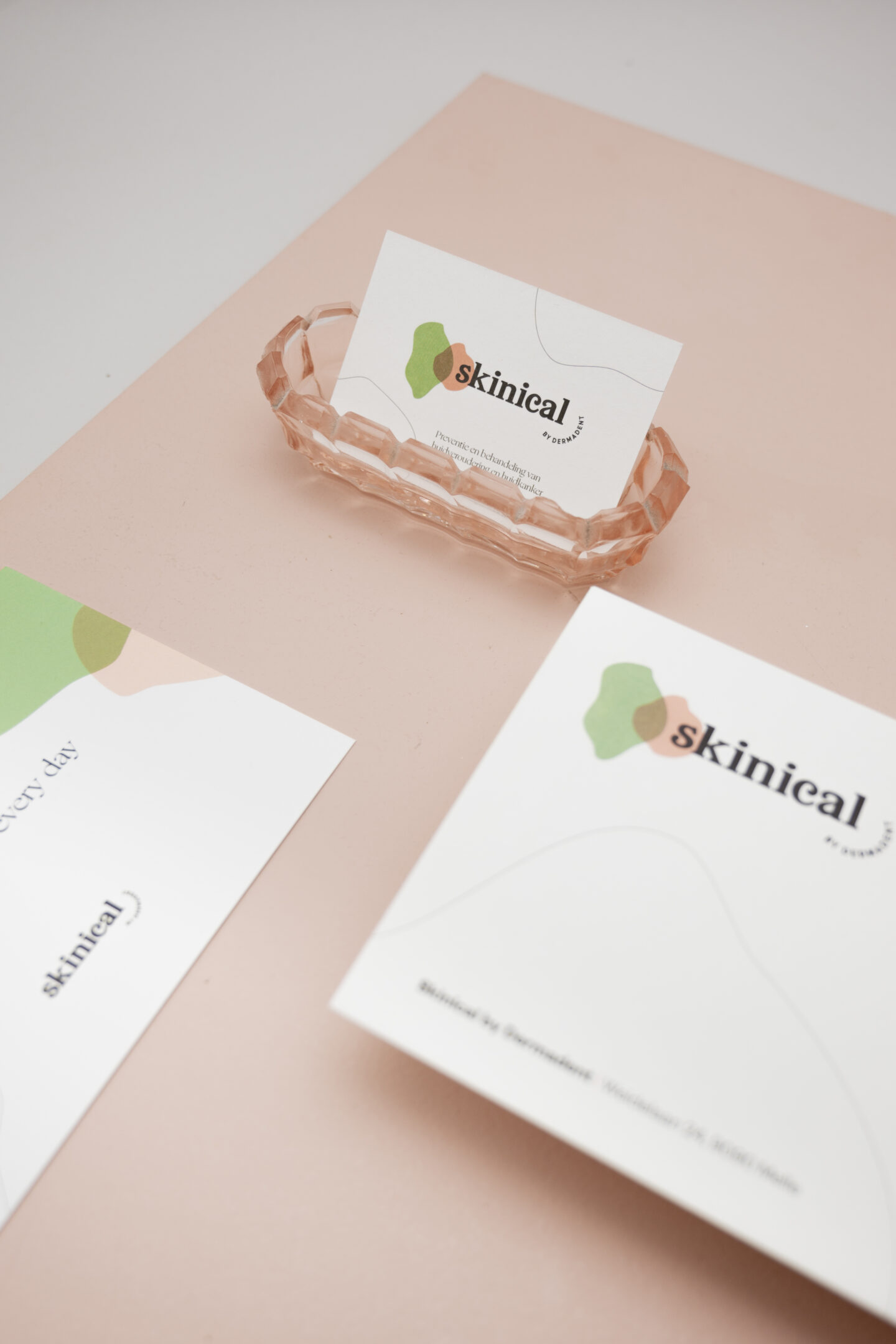
The name is presented and approved, now we can start with the face of Skinical. Dagmar's core business is made clear immediately by the graceful, organic graphics. The shapes represent the skin lines, the colours show what the dermatologist and her team strive for: to make you feel natural and young.
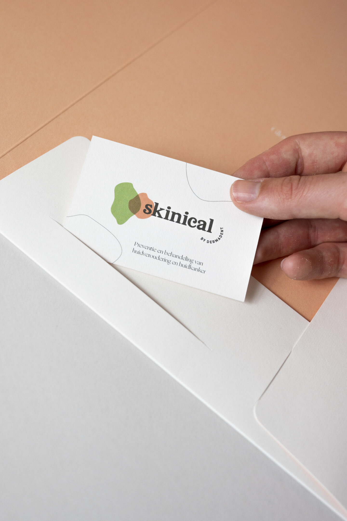
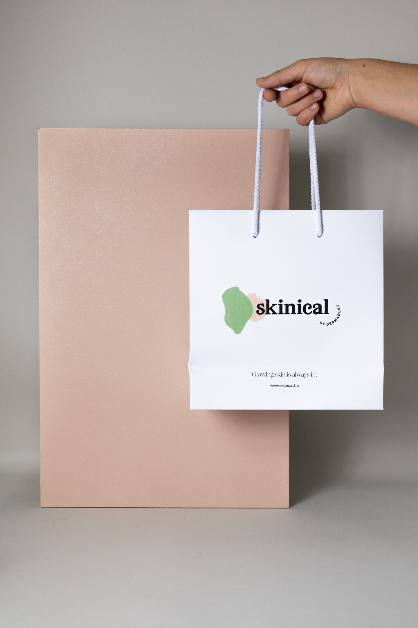
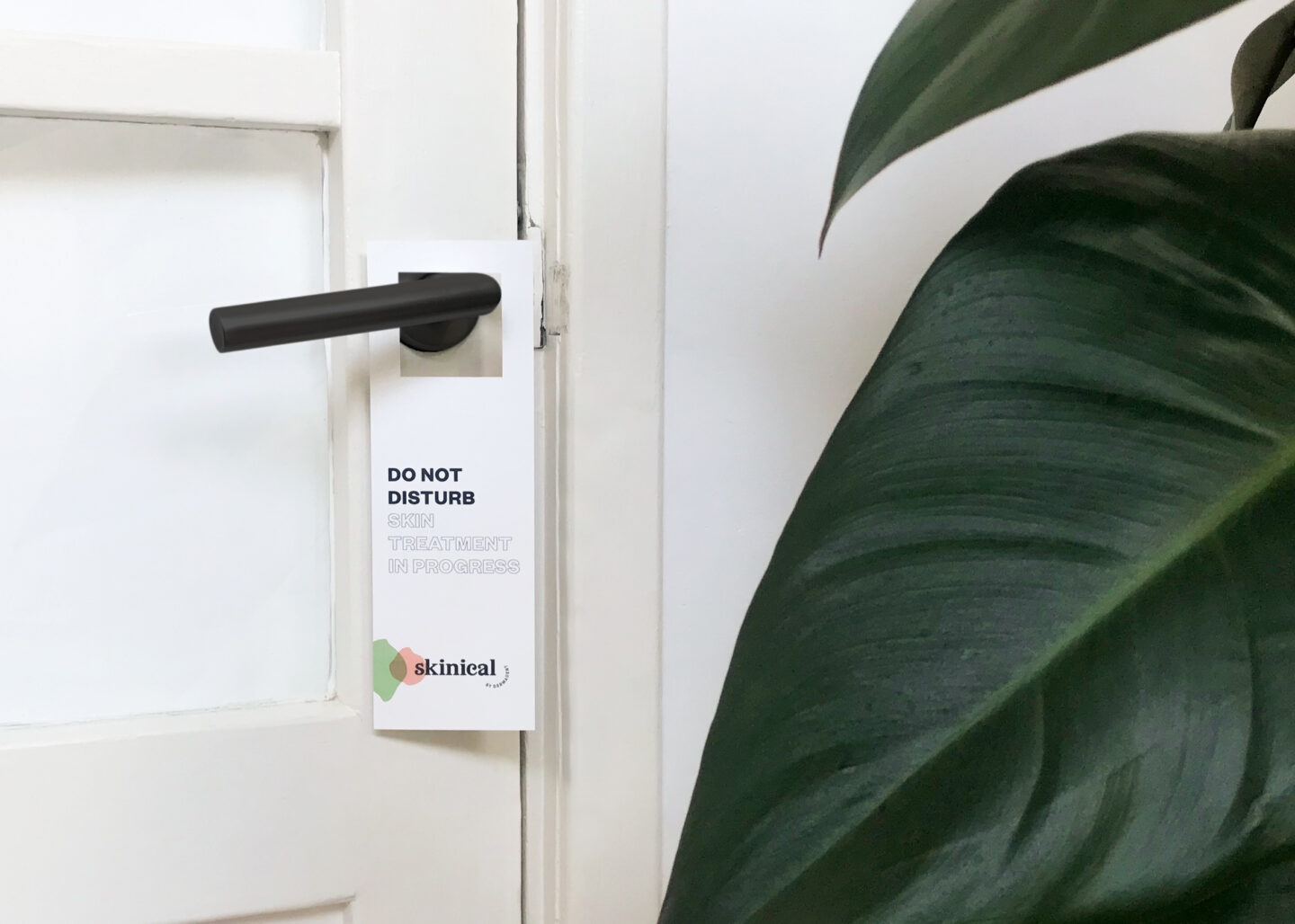
Hold on for a serious dose of corporate identity guidelines: goodie bags, hair bands, pens, file folders, do not disturb signs, business cards, window lettering, social media templates, brochures and lastly, gift vouchers. Skinical may and shall be seen.
Website
Dermadent's previous website was given a Skinical look on the outside and on the inside. We let the back-end pass through our fingers and smoothed out all technical wrinkles. Thanks to the soft pink CTA-buttons, the corporate identity is visible in a subtle way and with the fluent navigation you immediately find the right treatment. Skinical, you look good. And you're UX-proof too.
Communication support
We see it big. A strong brand like Skinical, that must be top of mind. With a sophisticated, strategic communication strategy Skinical quickly conquered the head of the target group. Brand awareness for the win with relocation communication to various target groups, teaser content for social media and the necessary buzz via newsletters.