Rekuup

Project naming
De Republiek and Handmade in Brugge want to appeal to a broad target group with the Green Retail project and therefore needed an accessible name. A name that everyone understands, can pronounce and is easy to remember. We also needed a clear link to the project's theme. And with Rekuup - to recover or reuse - those checkboxes were certainly ticked off!
Powerful baseline
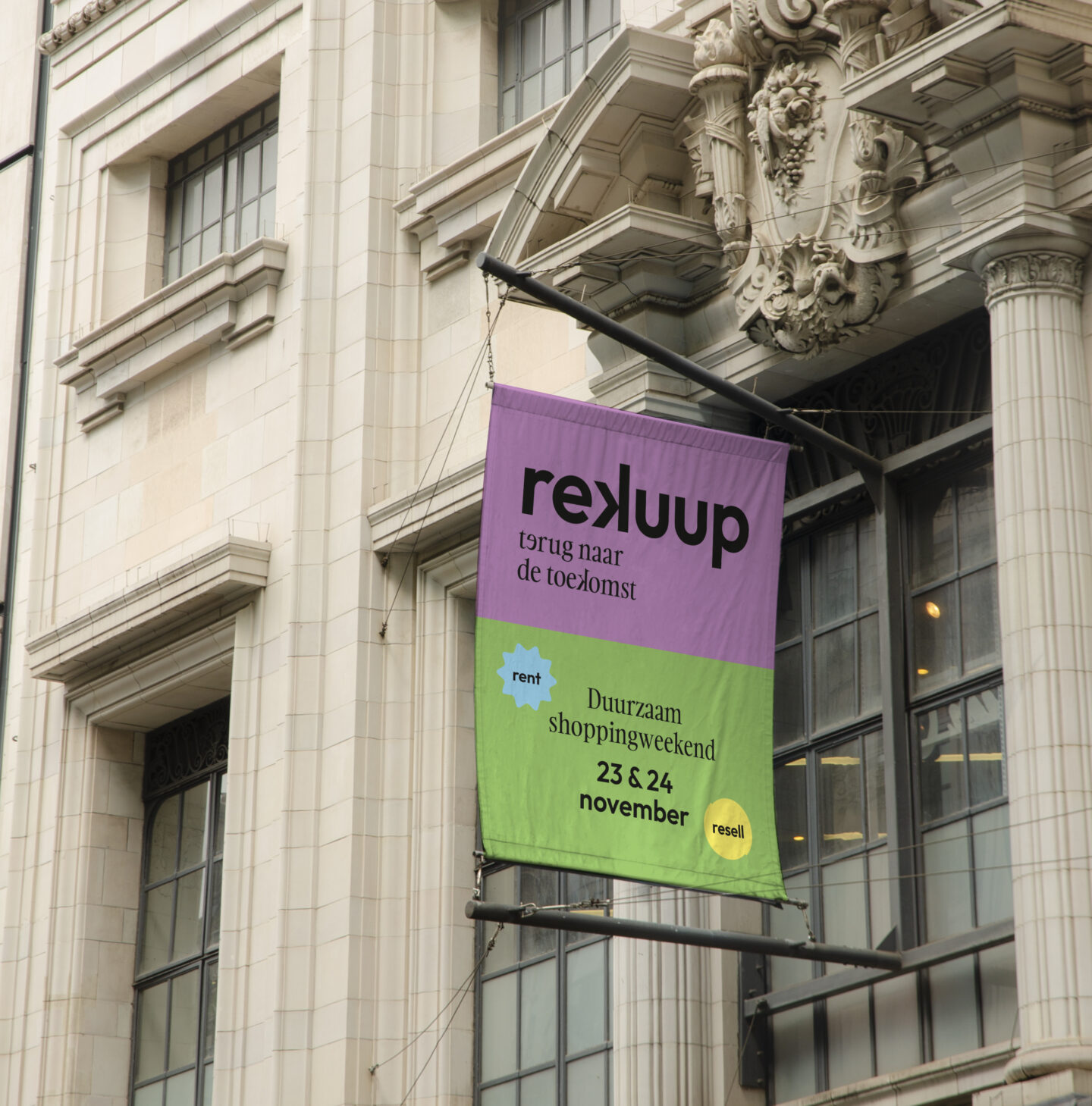
The baseline is all about craft, the core business of the 12 selected Handmade in Bruges makers. Back to the Future tells us that, on the one hand, artisanal, handmade products are of all times, but on the other, they have been replaced by mass-produced goods in our current consumer behaviour. If we want to have a positive impact on the future of retail, we need to go back to the past.

Branding
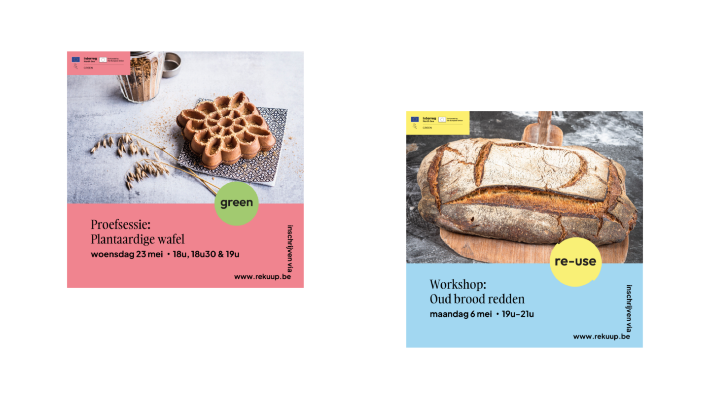
Like the name, the branding also had to be very accessible. We appeal to a wide audience and went for something that immediately catches the eye. In addition, Rekuup brings a positive story. That calls for colour. Lots of colour!
Icons
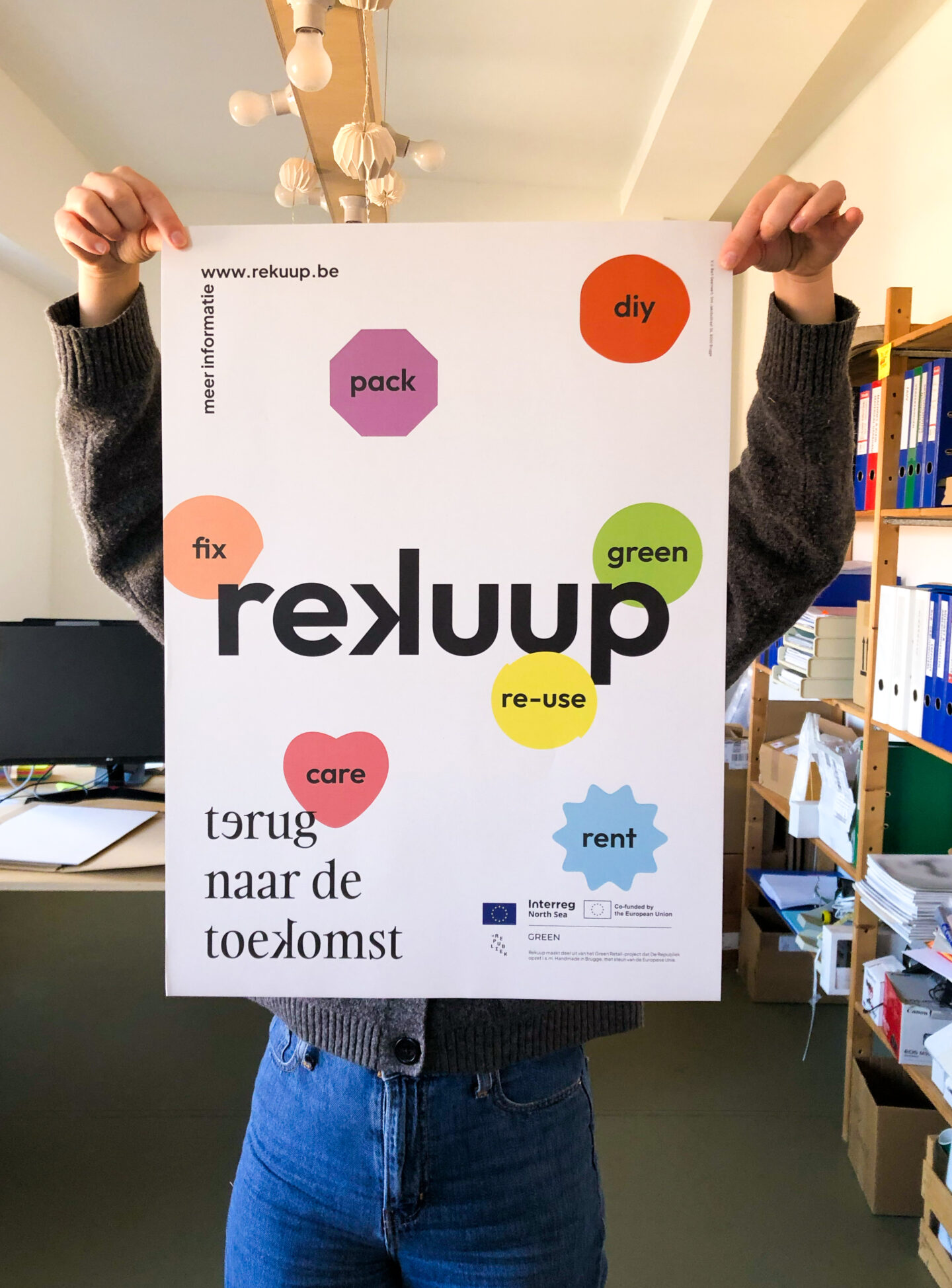
Rekuup pays attention to 6 sustainable and circular themes:
- Sustainable packaging ways
- Selling old goods
- Taking optimal care of your stuff so it lasts longer
- Repairing items
- Rent clothes, accessories, equipment ... instead of buying them
- Do it yourself!
For each topic, we created an icon that emphasises the visual distinction in communications and evokes recognition.
Curious about more Rekuup?
From April '24, De Republiek and the Handmade in Bruges makers will organise workshops, demos, talks, markets ... stimulating you, the consumer, to deal with stuff in a sustainable and circular way. You can find more information about the initiative on the website.


