Karel de Stoute

First things first! We set to work with the restaurant’s brand identity.
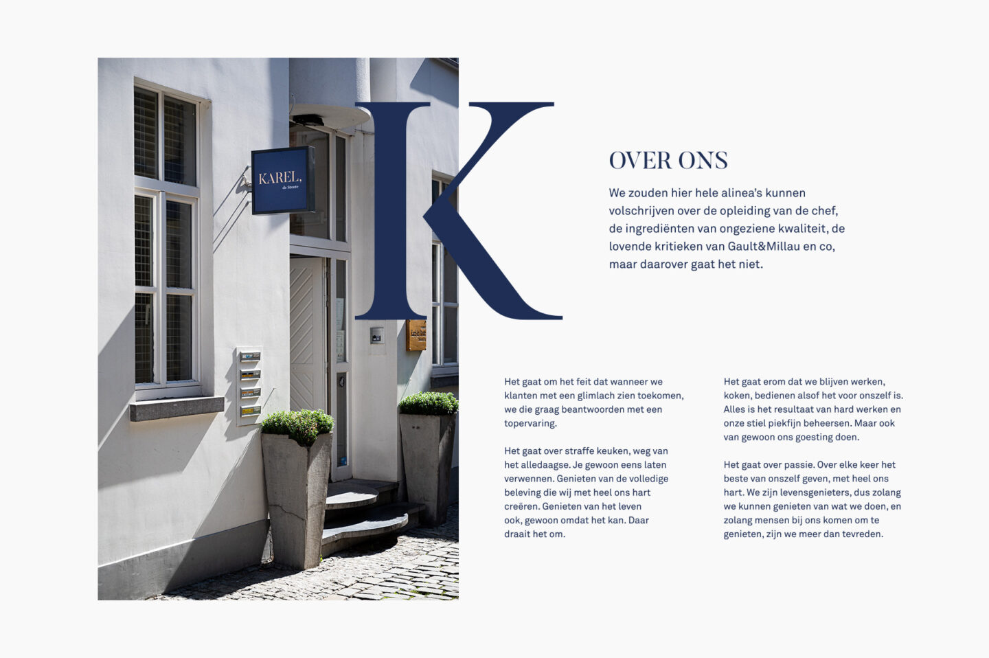
After a goal-oriented workshop session, we summarized the restaurant’s identity in a brand story that, without a blush, says what it’s all really about. Typical of Karel.
We also felt the need for a fun, comprehensive baseline. Simple, but in the right words. Because those are the words of value.

The brand story was the starting point for a complete rebranding of the Ghent-based restaurant, but the essence remained untouched: trustworthy, customer-oriented, with drive and gut feeling.
We provided this life’s work with a full makeover.

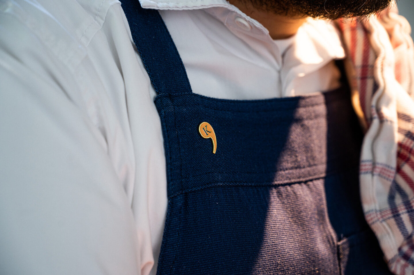
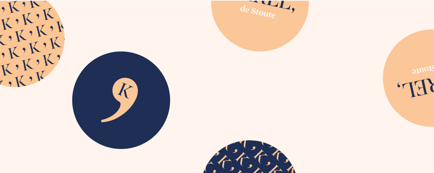
You might wonder: why the comma in the corporate identity?
We pitchforked Karel into the restaurant’s alter ego. ‘Stout’ (meaning ‘naughty’ or ‘bold’), however, doesn’t quite cover his personality.
Karel loves supreme cuisine, innovating flavours, enjoyable evenings with friends, just because one can, and service with a personal touch. A full stop says 'stop'; a comma says 'there is more'. In this case, ‘a lot more'.
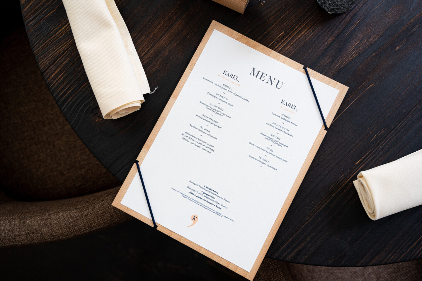
A menu that needs to be able to change every day, without losing character. That was the challenge chef Thomas and hostess Lien served up for us. We happily sunk our teeth into that and created a flexible yet stylish system. Bespoke, of course, in collaboration with Details Design.


Paper embossing, two layers of paper and that beautiful royal blue: those are the ingredients for Karel De Stoute’s business card. A cherishable one, just like the memories of your nights at this restaurant.

Karel de Stoute, that is a culinary experience everything centres round enjoying. After their rebranding, a new website was only too obvious. Designed with 💙 by De Barbaren.