Jilles
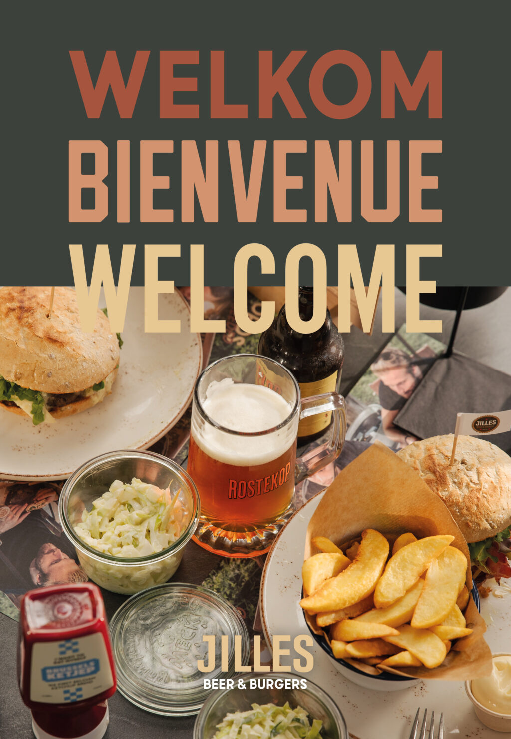
What should the logo and corporate identity convey?
First and foremost, Jilles wants to show that it is not your average fast-food restaurant. This is where you come to enjoy homemade comfort food and punishing Belgian beers. The menu overflows with characterful food, and the locations breathe oldschool cosiness. An oldschool restaurant with character? We could do with that in terms of branding.

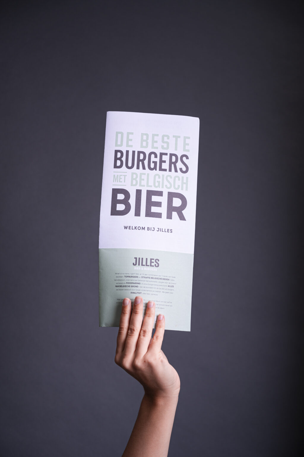
Corporate identity update with new colours and logo
At Jilles you always feel a bit at home. The warm, cosy homeliness can also be felt in the branding. The soft red and brown tones are reminiscent of the rustic interior elements you spot in every restaurant. Mint green and yellow ochre provide fresh accents.
Logo design
On the one hand, the logo is simple and sober to appeal to a broad target group. On the other hand, the bold letter also makes the brand stand out immediately. The result is a timeless design with vintage vibes.
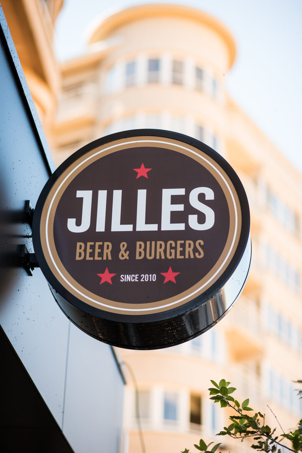
Signage at every restaurant
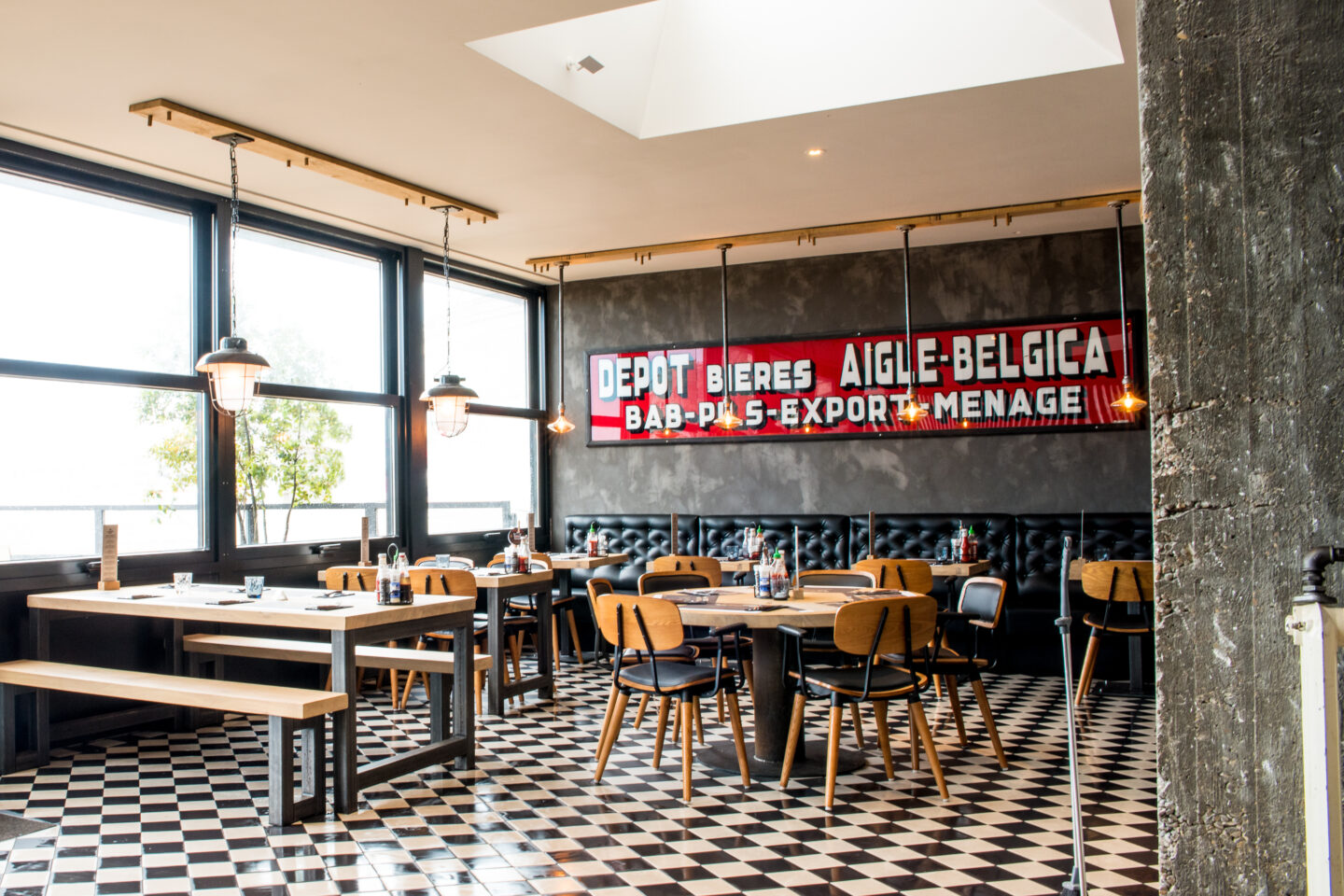
You can always find Jilles in characterful buildings in bustling city centres.In order not to detract from the authentic buildings, we developed stylish but modest signage. No striking, garish colours but accessible and casual design.
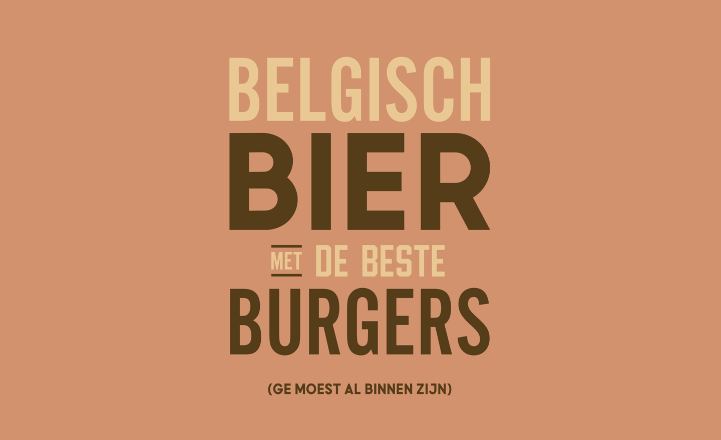
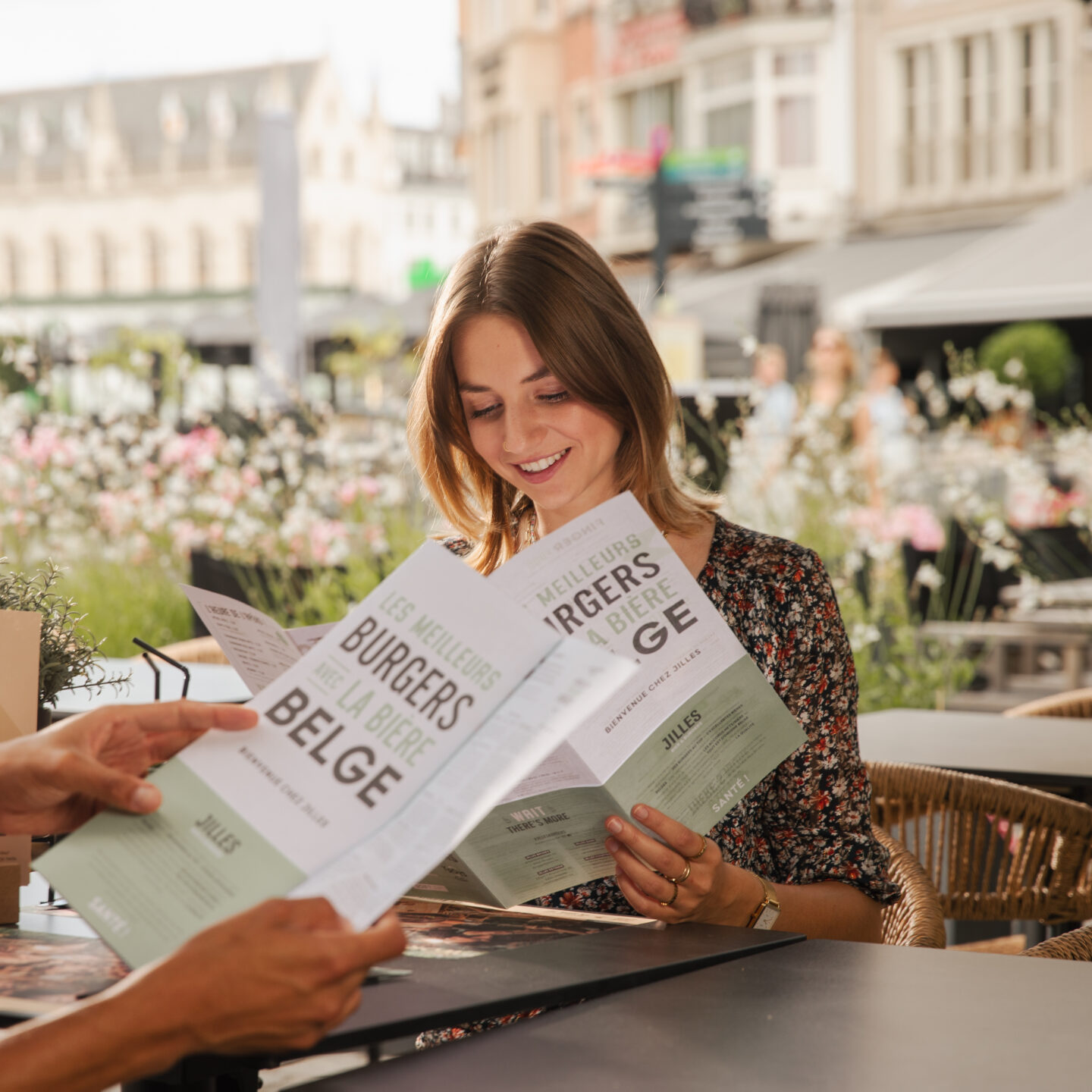
Flyers, buttons, dibonds, clothing ... and Rostekop!
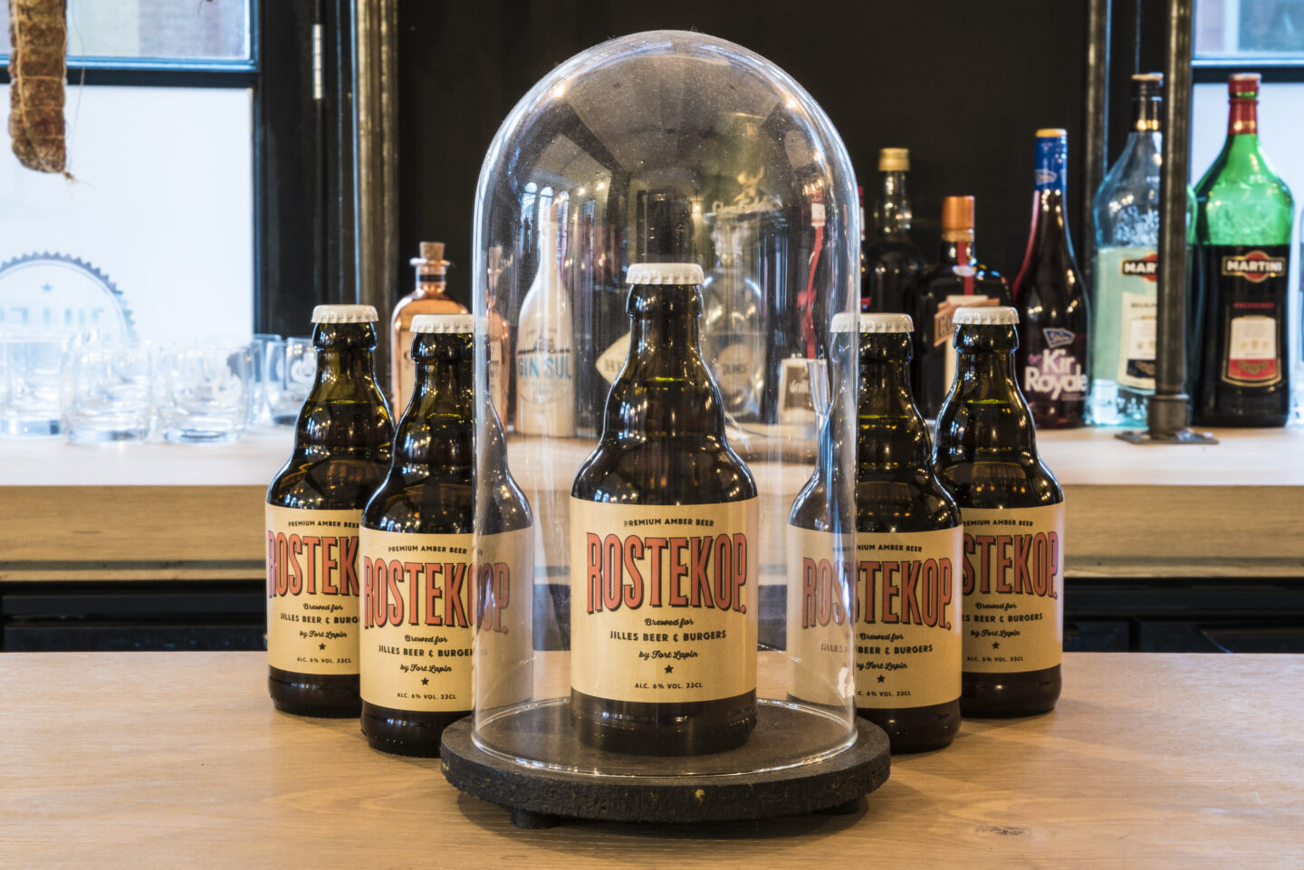
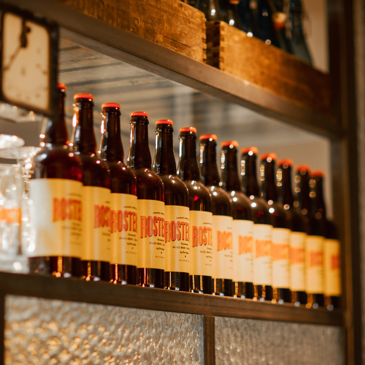
In the space of 10 years, we have already produced a whole host of corporate identity products: flyers, dibonds, clothing, buttons, even our own beer! For Rostekop, we went one step further.This daughter brand of Jilles caught on so well that it deserved its own branding.
Design and print support for the menus
The menus are full of golden combinations. The design exudes a warm and cosy atmosphere that suits the comfort food served by the restaurant.
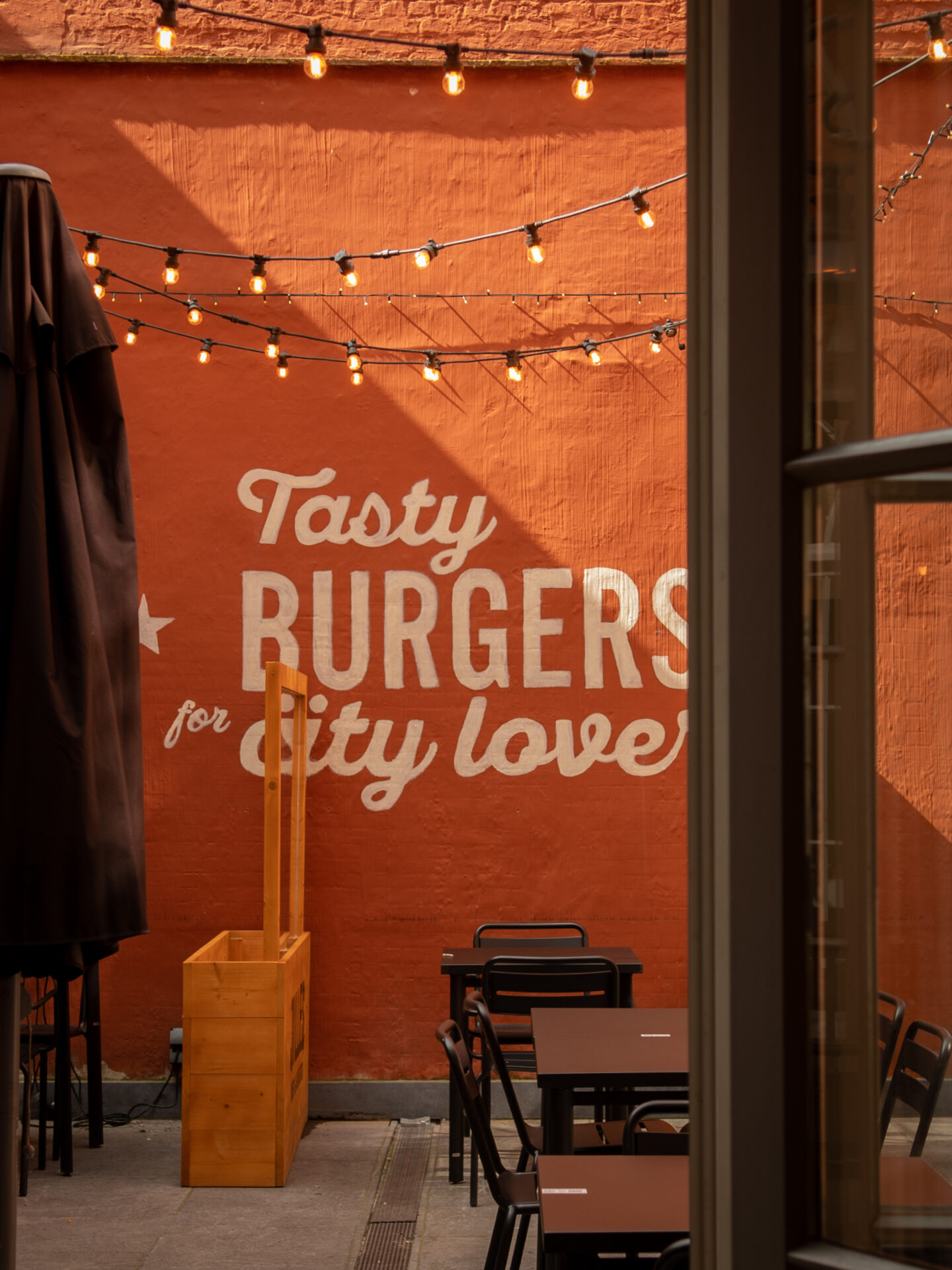

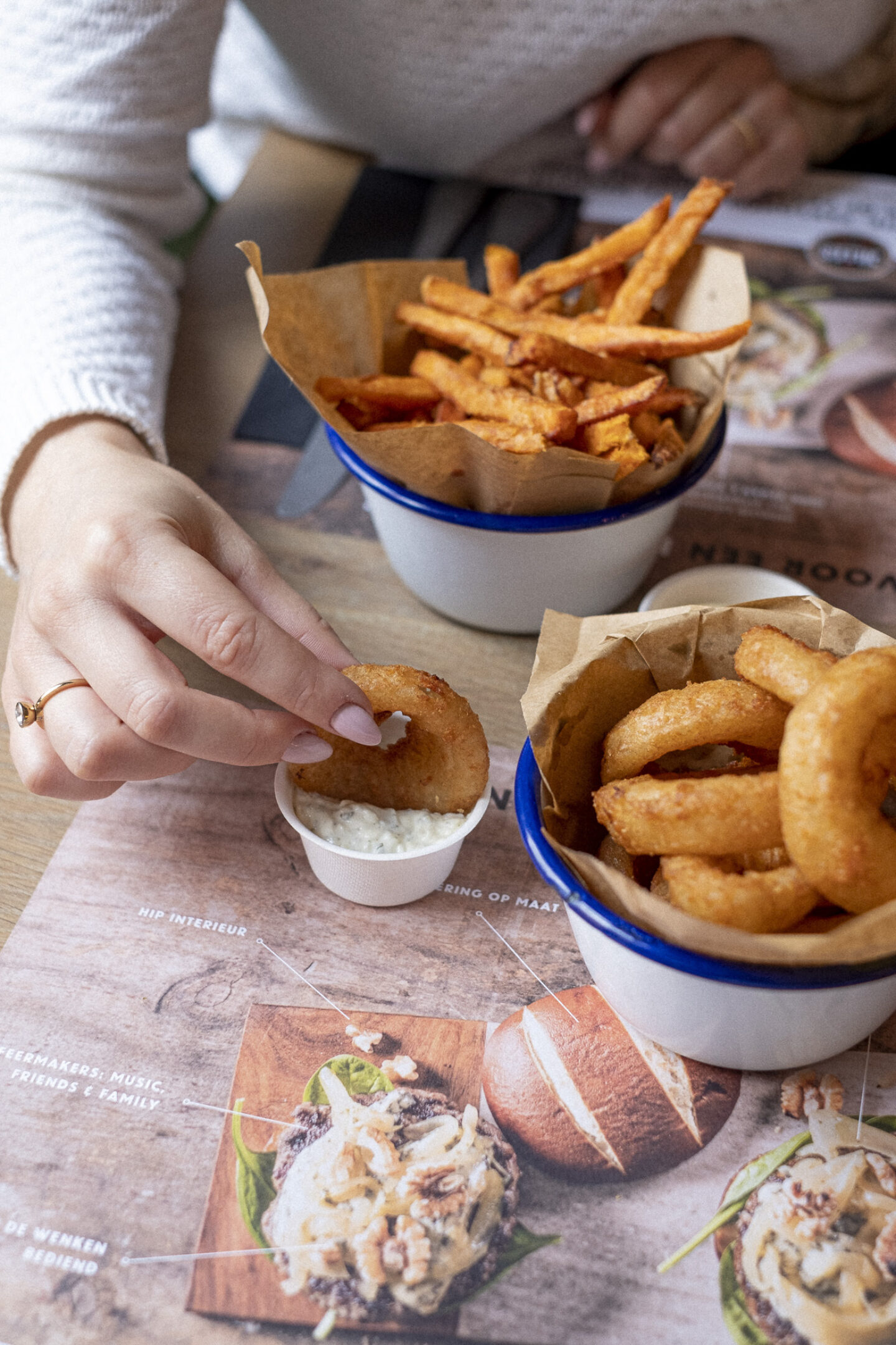
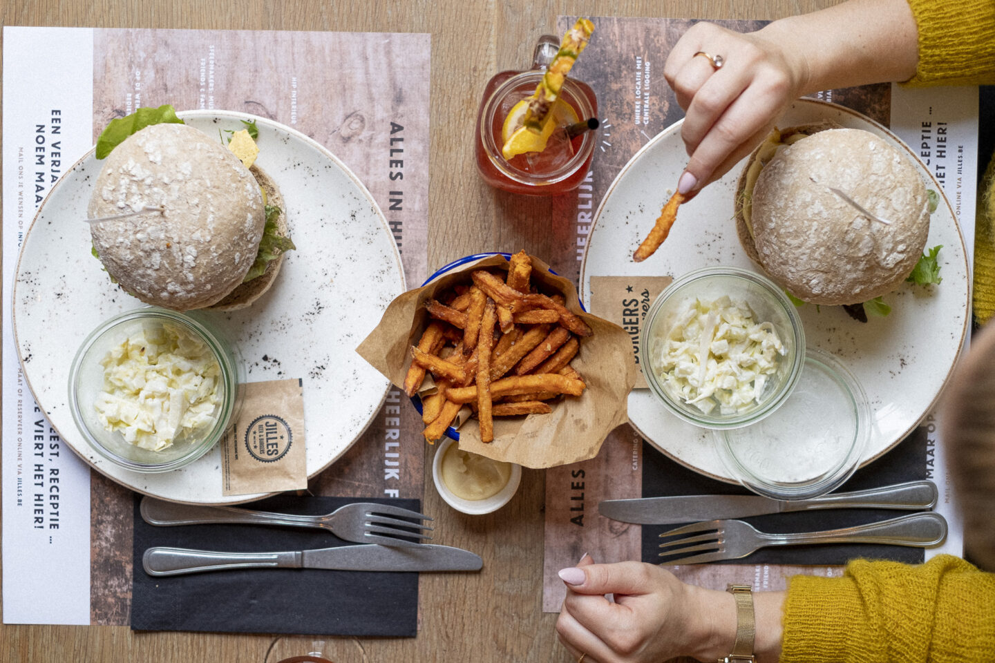
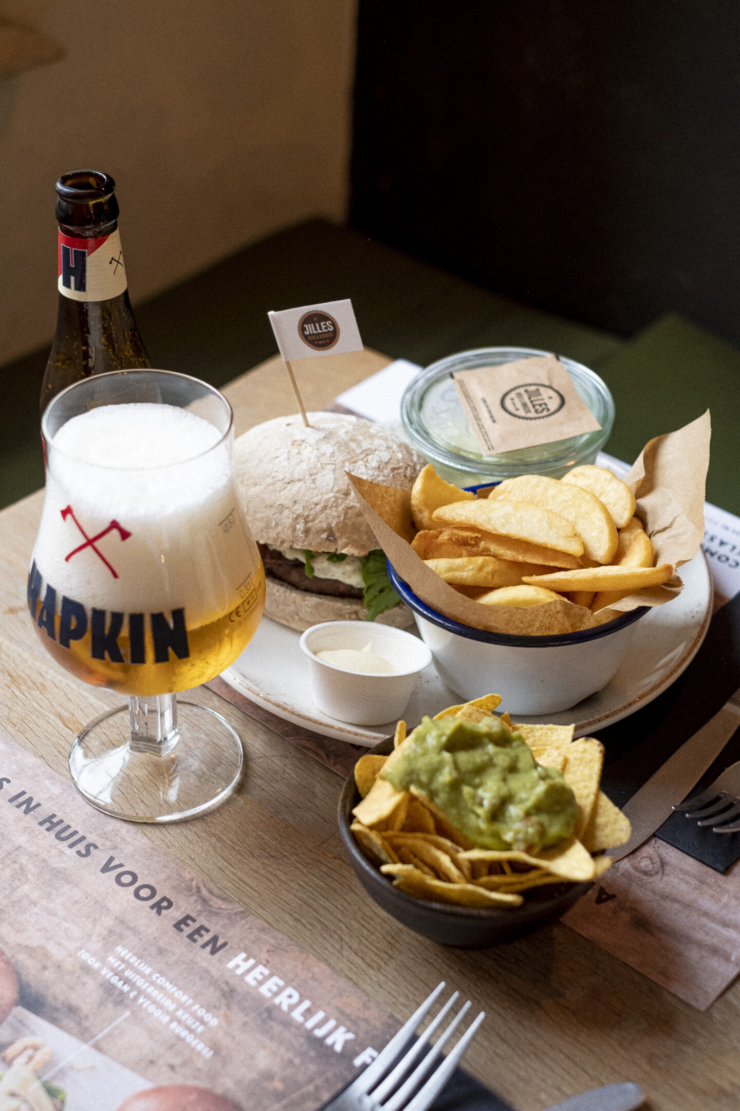
Photography strengthens your brand image
Communication tools such as the website, social media and newsletters need high-quality images. Images that make your mouth water.
