Hofwerk

A new name, logo and corporate identity for Tim's company
Name branding
First up: the name. We went for a powerful name, one that makes it clear that Tim knows how to get down to business and that he will roll up his sleeves for any project. In addition, Tim is a bit of a jack-of-all-trades. You can hire him for any kind of garden work.
After several brainstorming sessions, competition and market research and a pitch, 'Hofwerk' emerged as the winner, with the reinforcing 'Gardens Tim Polfliet' as the baseline.
Branding: logo, corporate identity and derivatives
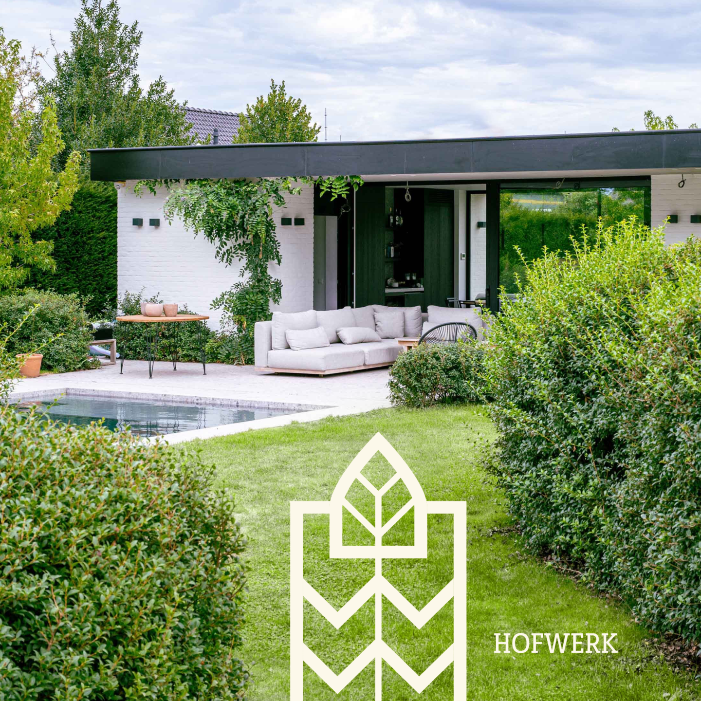
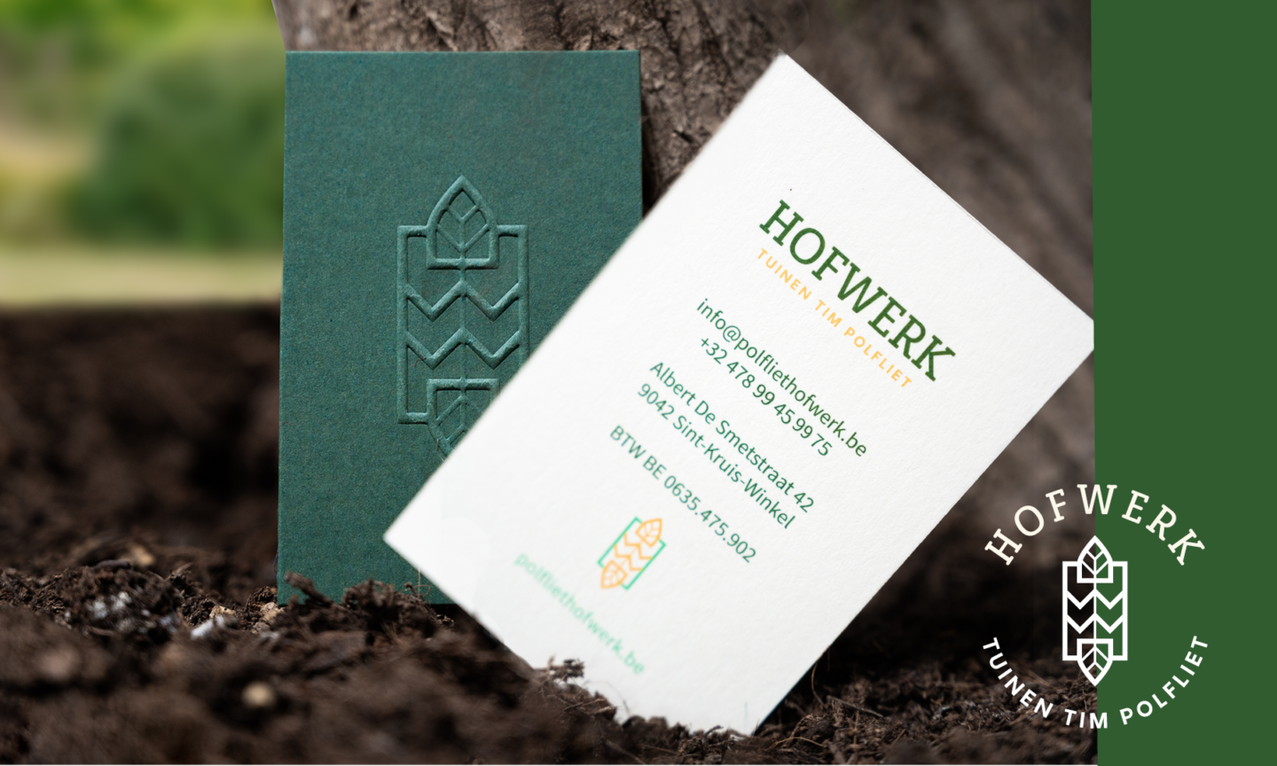
Hofwerk primarily caters to the needs of the upper middle class. A branding with a rather premium look was our starting point. A serif font for the logo is ideal for this. The grass green then establishes a clear, recognizable link to Tim's niche. Finally, we reinforced the corporate identity with an illustration, to be used separately as an element but also to complete the logo.
You only really experience the premium feeling when you see the business card. The logo on the front comes out even better thanks to embossing, a printing technique that creates extra feeling with relief.
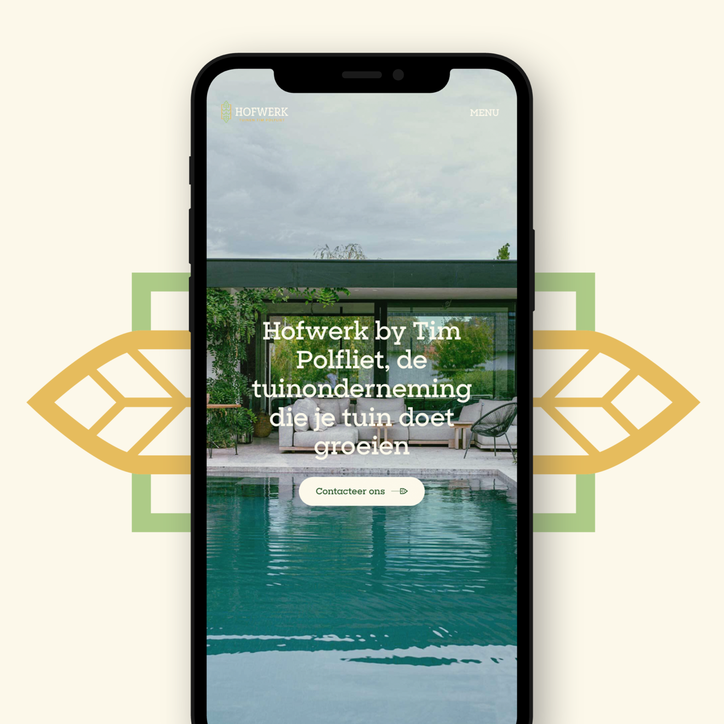
Custom website
The branding grew into a custom website, including animation of the logo element. It was important to Tim that the website gives a clear picture of his projects. This way, the customer immediately knows what to expect. Also his expertise in the field of larger garden works had to be presented extensively.
Finally, Sanne and the two children also got a place on the website. Not only is and remains Hofwerk a family business, in this way we give the brand identity a personal, recognizable touch.