Museum Hof van Busleyden
Logo rebranding
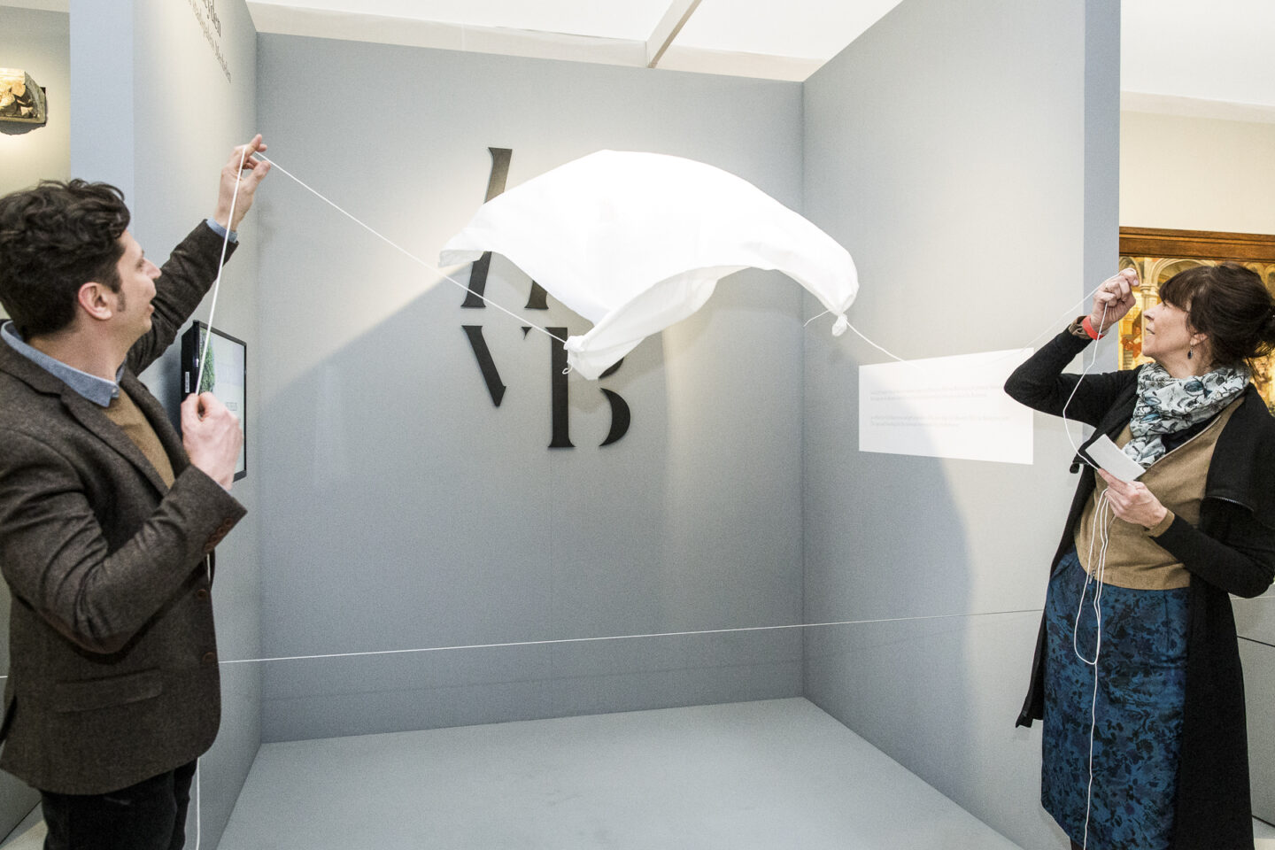
When rebranding, anything is possible. You can go for a completely new house style, or, like Hof van Busleyden, opt for an update. The museum focused on readability and recognisability. At the same time, the logo needed to be more modern and youthful.
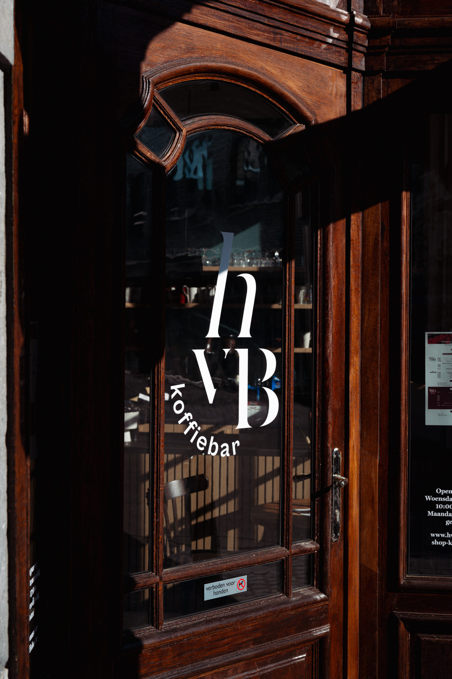
The initials are now familiar in the streets of Mechelen, so the choice not to tamper with the structure of the logo speaks for itself. We opted for a more refined optimisation of the typography. Thus, the 'Hof van Busleyden' exchanged its serif font for a sleek and timeless font. Finally, the Friends of Museum Hof van Busleyden and the cosy coffee bar got their own derivative of the logo.
Expanding the brand colours
No better source of inspiration than beautiful works of art. When expanding the brand colours, we purified commonly used shades in the paintings. The result is a broad colour palette that lends itself perfectly to variation in the many communication products.
Brand identity guide
Refining the logos and expanding the colours, translated into an in-depth brand guide. Two birds with one stone, as the development of the brand guide also involved the creation of the communication products for the official reopening.

Campaign material for the reopening of Hof van Busleyden
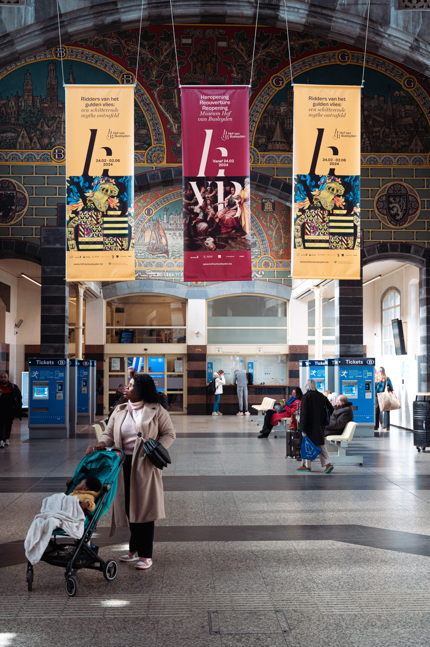
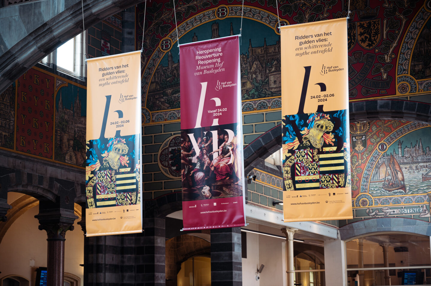
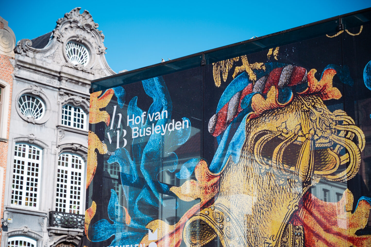
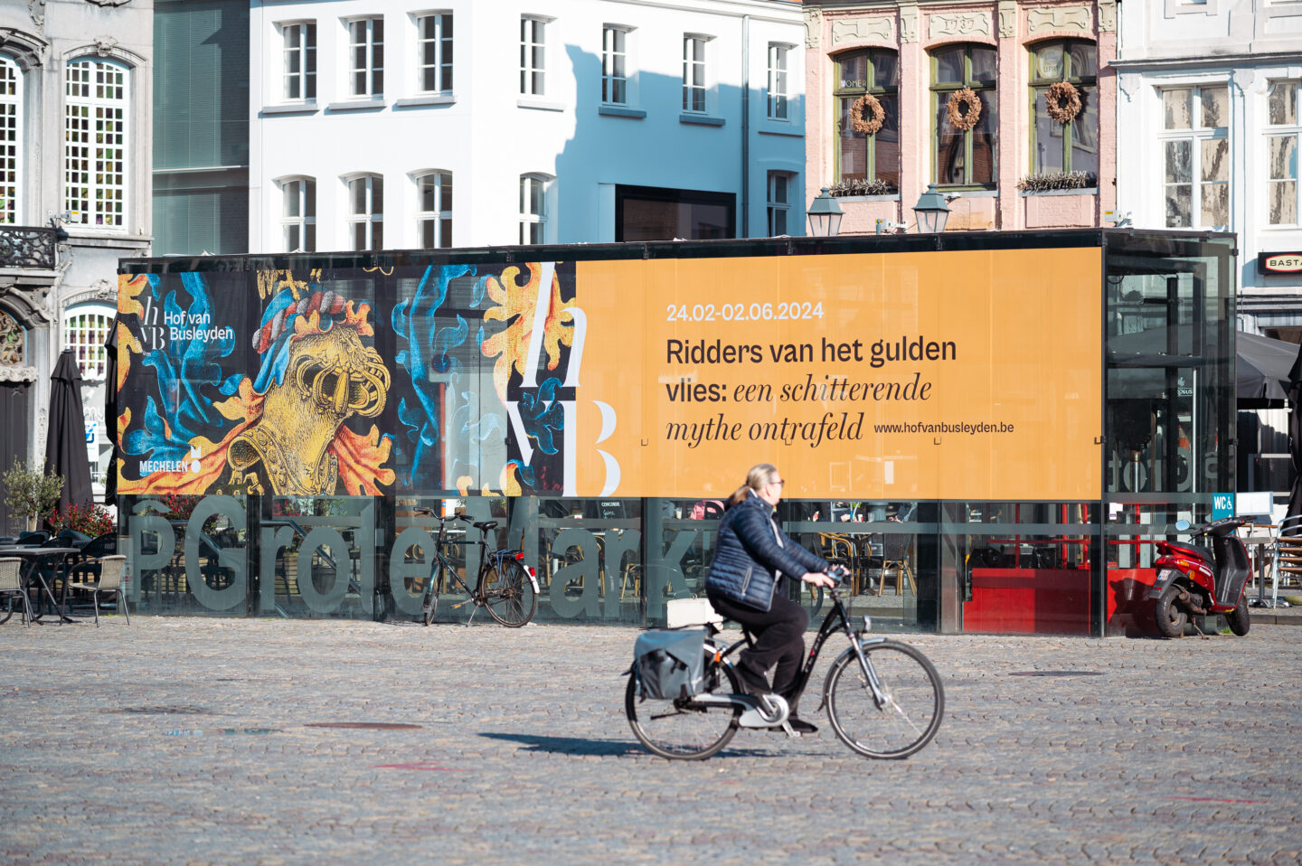
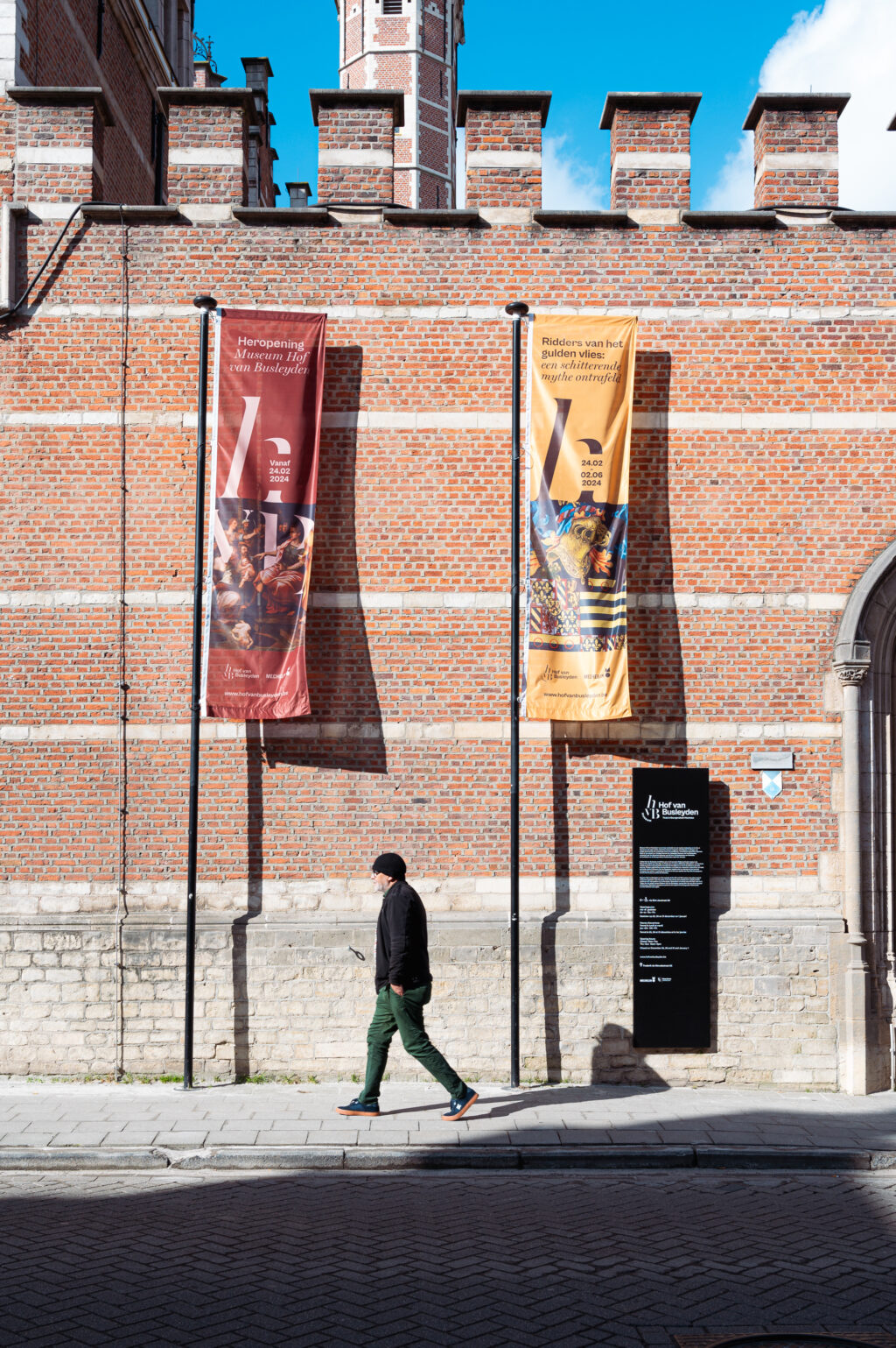
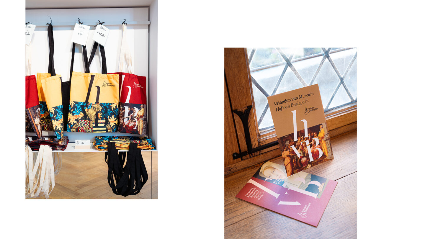
Not only in Mechelen but also in numerous other Flemish cities you spotted campaign images for the opening exhibition. We designed various posters, banners, leaflets, flags, flyers, etc. We also looked at the corporate identity items that are used on a daily basis. Think business cards, lanyards and tote-bags, and a logo animation for digital applications.
Planning a visit to this Burgundian city soon? Then Museum Hof van Busleyden is definitely worth a visit. Thanks to all the museum staff for this fine collaboration!
