De Republiek


Challenge
When you ask the average citizen of Bruges how they know De Republiek, the answer is invariably: "I go and have a beer in the Grand Café". Due to the successful and rapid expansion of the restaurant, the profile of the social platform was diluted. Yet De Republiek is much more than just a bustling Grand Café. It is up to us to make that message clear.


Research questions
How do we ensure that the platform and the Grand Café have their own recognisable identity, and that they reinforce each other at the same time? How do we make the different projects the platform supports known? How do we attract new partners, interested parties, investors, projects...? We formulated an answer to these questions in the form of a layered visual brand identity, a clear brand story and website that bundles the story of both the Grand Café and the platform.

Creative preliminary process
Developing a brand identity for an organisation as complex as De Republiek requires careful preparation. By observing on site, we experienced exactly what De Republiek is. Conversations with visitors and staff members, the use of colour and texture in the building, the atmosphere: everything we experienced was inextricably linked to the organisation's ideology.

Brand story
Every aspect of the organisation breathes accessibility and sense of purpose. Not for nothing do the employees describe the stately building in Sint-Jakobsstraat as their 'home'. We captured that feeling in a brand story that makes clear what De Republiek as a whole stands for and wants to achieve.

Branding
By making an abstraction of all the colours and textures present, we gave a direction to the visual identity. The result of this case study is a modular branding, with edgy typography and colours that complement those of the building.
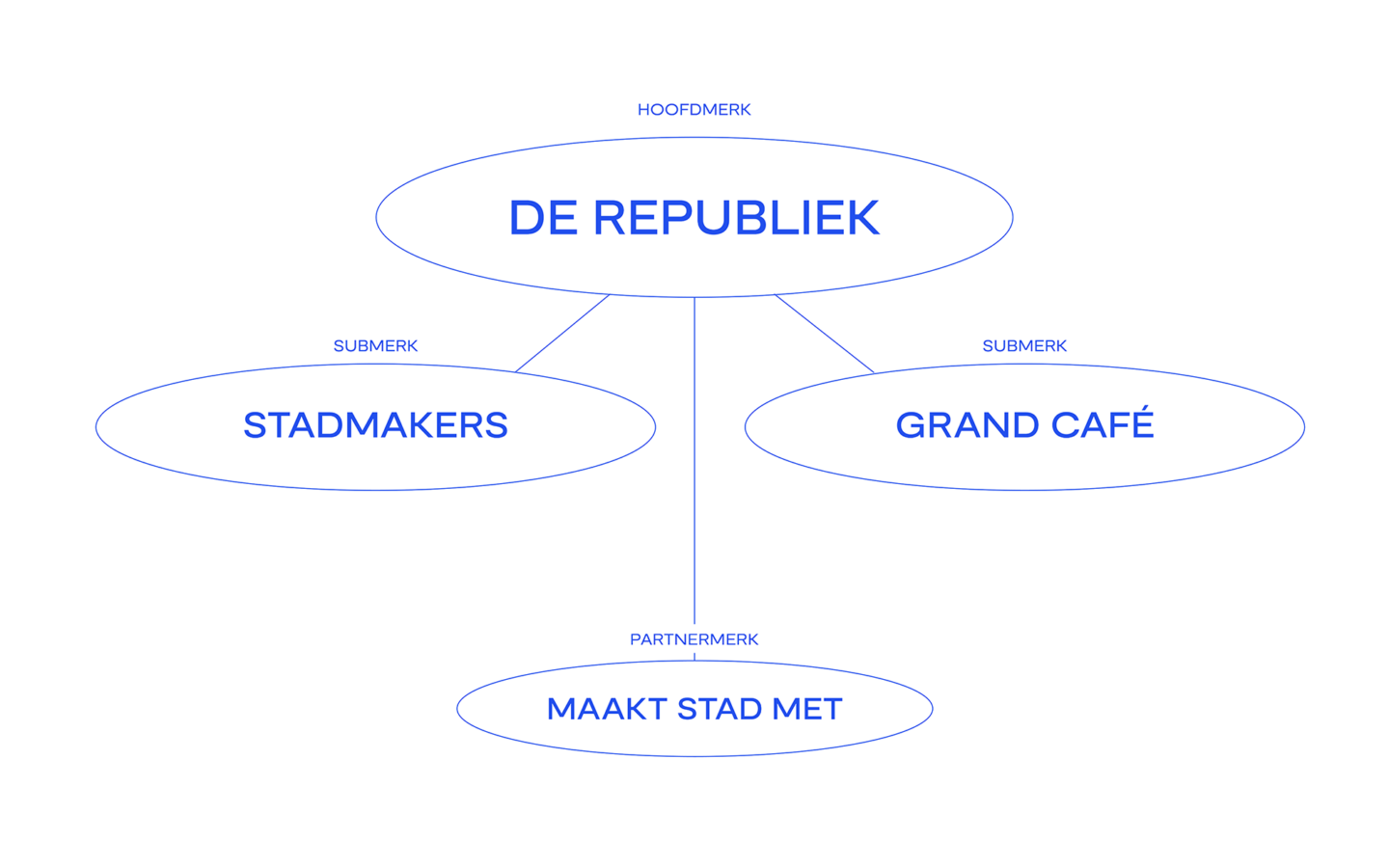
Different logos as an entry point
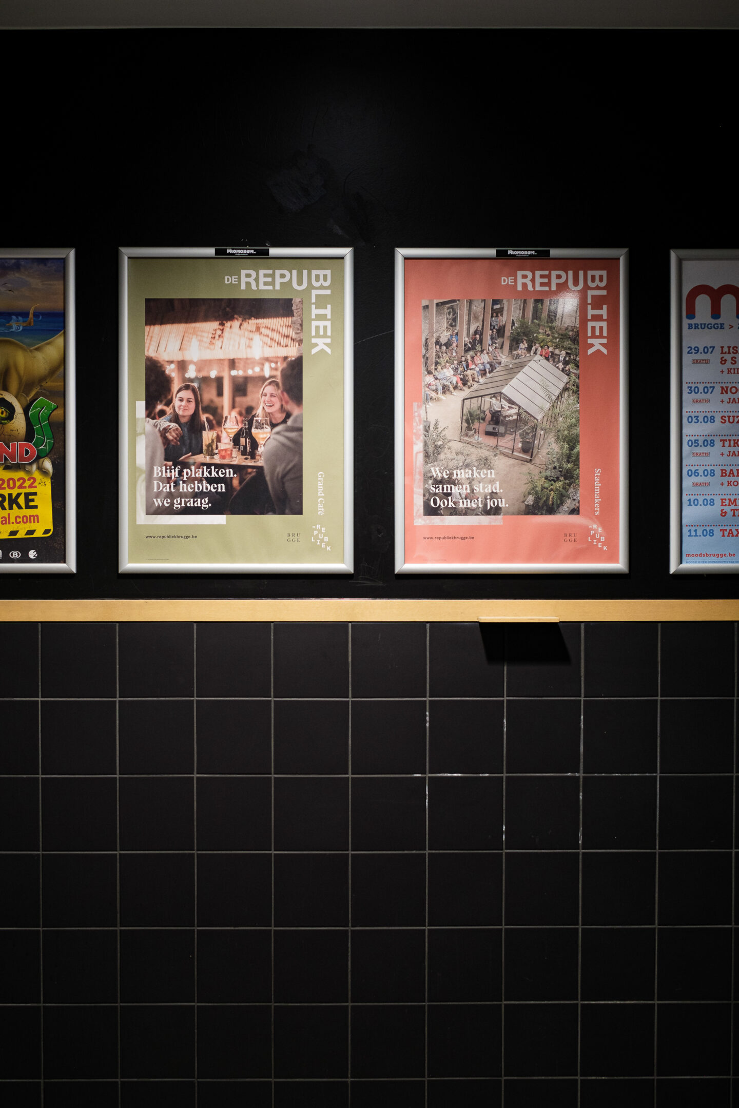
The two logo variants each have their uses. The waterfall logo is the ideal entry, perfect when De Republiek needs to stand out. The corner logo provides space when De Republiek needs to be less prominent. To distinguish between De Republiek as a platform and De Republiek as a catering establishment, 'Grand Café' is given an accent colour. In this way, the two logos work together but are still strong separately.


Colour and typography
The branding is characterised by soft, fresh colour graphics. Lots of colours. They are a direct translation of what we saw and experienced in De Republiek. The typo is bold and characteristic, it catches the eye. And that's a good thing, because it's time for this organisation to conquer its place in society.

Website
From the moment you land on the home page, you are drawn into the story. It is the online interpretation of that eclectic, rebellious atmosphere that resides in Sint-Jakobsstraat. Sleek and clean do not belong here. References to the brand story and the visual identity can be found everywhere.
The new identity of De Republiek creates a clear, recognisable image of the social platform and the Grand Café. We no longer see two separate brands, but one strong brand with the same values and standards.
Want to see the awwward winning website for yourself? Check the website here!

Corporate identity toolbox
To give the branding more punch, we chose to print on paper in the company colours. We finished off the various means of communication with halftone photography. This way, we ensure extra underground vibes.
The building and the staff were also given a Republiek stamp. And you can see that De Republiek is becoming more and more recognisable, more and more clearly profiled.

Social media
Social media play an incredibly important role in profiling. With a comprehensive set of templates, De Republiek catches your attention everywhere.