De Bijloke


Challenge
Every organisation benefits from an update of its brand identity from time to time. A critical look from the outside can refocus your brand's positioning. De Bijloke's communication team got stuck on the previous house style after several years and therefore called on our graphic team to redefine the visual guidelines.

Update visual identity for De Bijloke
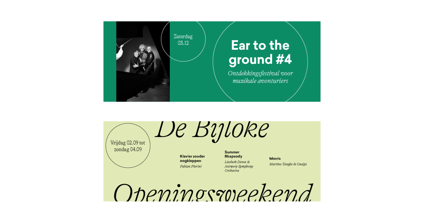
We reviewed the colours, fonts and how photography and illustrations were translated into graphics. The existing logo was kept, but the familiar sphere was given a different colour for each music genre. To guard the consistency of the style, we developed a corporate identity manual with all the trimmings. Think of an icon set, several templates, a study of the new font, a grid system so that the derivatives with photos always have the right layout ...
After researching the new font, the choice fell on a clear and uncluttered main font with a friendly character. We complemented this with a characteristic and atmospheric serif font.
Not only the font was updated, we also took a close look at the colour set. Each music genre now has its own colour palette, so that the target group immediately makes the right association.
Derivations from the house style
Quite a few derivations. We created visuals for the social media channels, banners for the website, e-mail signatures, signs in the building, etc. We also took care of the posters. Have you already spotted them in the Ghent city centre?
Animations
We also attached great importance to the experience and dynamics of the music centre. We bring these two pillars of De Bijloke to life in a series of lively animations.

