Bricks Advocaten
Challenge
Bricks is built on a team of young, driven, competent people, and that is a given. Each of them wants to be a sustainable and meaningful partner in their clients' business. Through fresh but also powerful branding, website and brand story, we show that these lawyers and jurists are not lacking in expertise.
Tailor-made website
Web design and user experience
Dark green takes the upper hand on the website. In this way, the design exudes tranquillity and quality. The fresh light green is in place in the call to actions and other buttons. This attracts the attention needed to stimulate conversions.
The deeper pages, on the other hand, were given a white design. Because they bundle a lot of content, readability there is very important. A lot of text on a dark background looks very heavy and deters visitors.
Only relevant clicks. That is our goal time and again when we create a website. Bricks Advocaten's is a prime example: from the home page, you can navigate to the right specialisation with just one click.
Web copywriting
On the one hand, the copy focuses on the role Bricks Lawyers assumes within the target group's business. On the other hand, we also emphasise the strong legal knowledge and specialisations. The tone of voice is perfectly balanced: formal and professional, but not corny or classic.
The mission of Bricks? You will discover it on the about page, completely dedicated to the brand story.
Branding
Logo
With one foot in the legal profession and the other firmly in the corporate world. That's how the managers of Bricks Advocaten describe themselves. This combo of knowledge and entrepreneurial spirit makes Bricks a partner to build on and that is exactly what we wanted to capture in the logo. The creative design process resulted in a powerful logo with a block system.
We also found the young team an indispensable element in the logo. We emphasised this by varying the positioning of the blocks to create dynamism.
Finally, we chose a powerful, slightly angular letter. This shows that Bricks Lawyers does not lack expertise.
Use of colour
These characteristics are also reflected in the use of colour. The fresh green house style colour looks youthful enough, without appearing inexperienced. The complementary dark green has a calming effect and shows that Bricks is determined to fulfil its partner role.
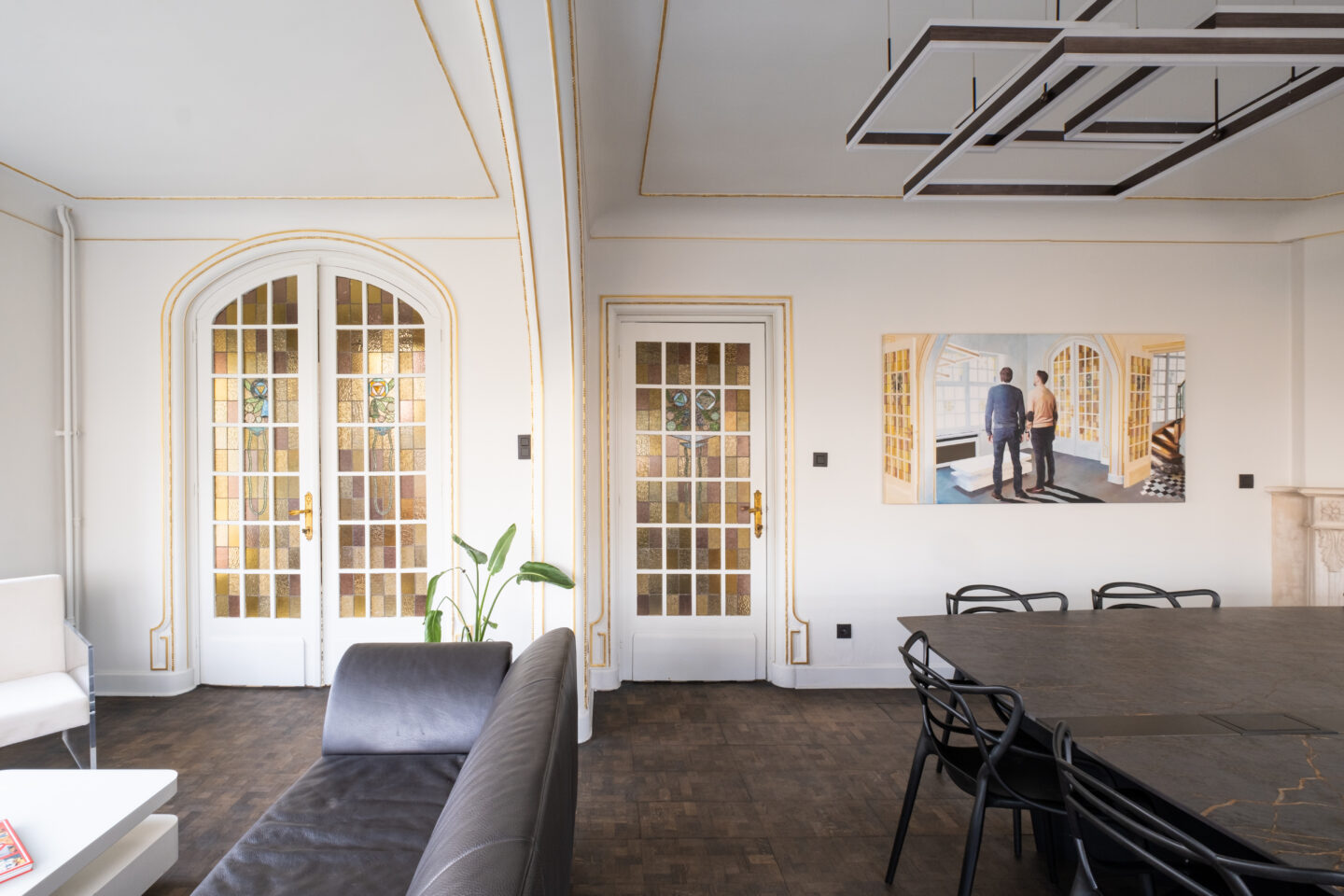
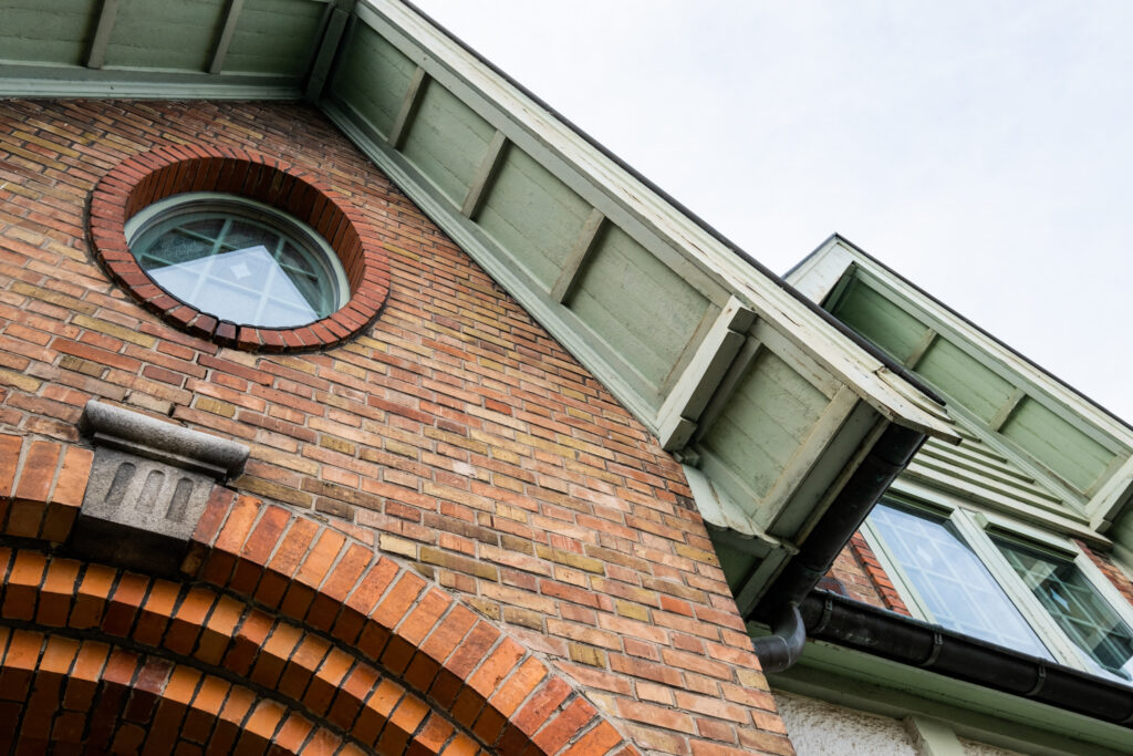
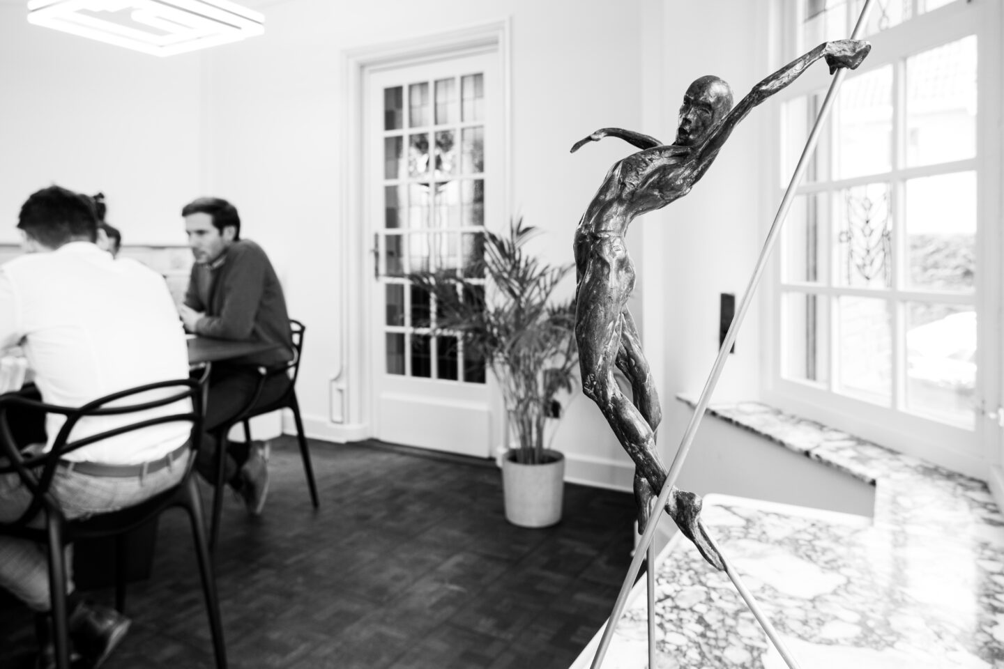
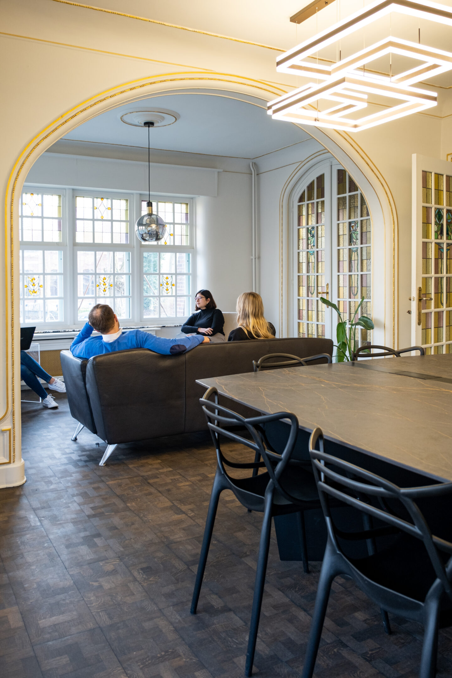
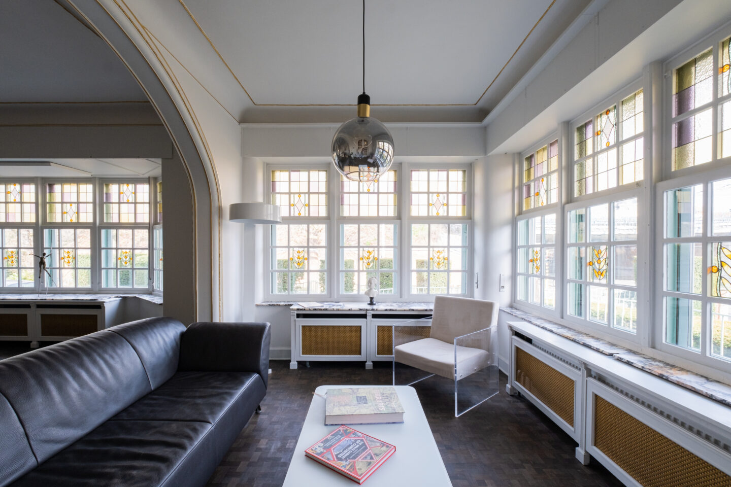
Photography
Professional and presentable photography instantly takes your branding and website to the next level. Thanks to consistent images, created especially for the website, the whole look is spot on.
