Bargino

Bargino
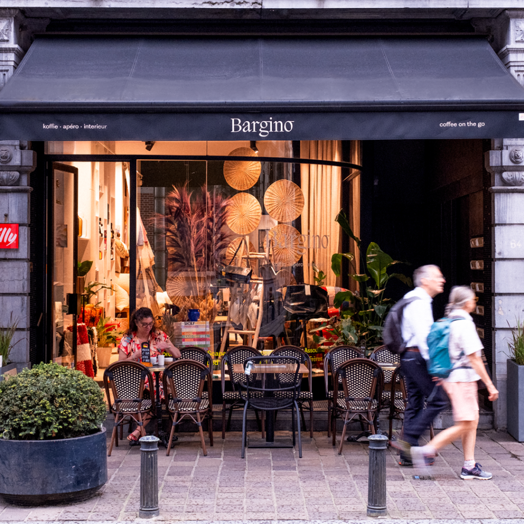
Bargino: picturesque village in Italy and cozy coffee, apéro and interior store in Ghent. We created branding with a high-end look on the one hand, that also retains the link to Italy on the other.
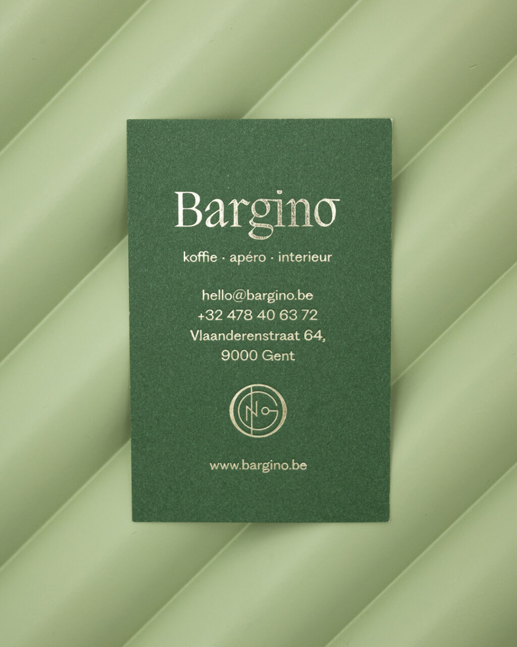
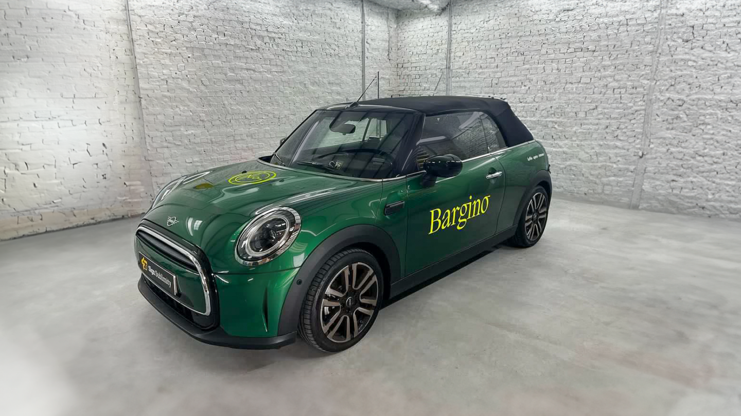
A sophisticated main logo
Bargino's refined and elegant letter logo fits seamlessly with the premium, high-end look of the business. With this timeless logo, we immediately emphasize the quality of the products, and by extension the entire brand.Increase recognizability? We do that by applying the font consistently throughout the entire corporate identity. This way, Bargino leaves a lasting impression.
Logo symbol with Gino
The main logo is complemented by a logo symbol composed of the letters of Gino. The combination of the symbol with the letter logo, forms a visual duo that strengthens and enriches the brand identity.
In addition, the logo symbol is also strong enough to be used on its own. This allows the brand to communicate in different ways and platforms, while still conveying a unified and distinctive message to the audience.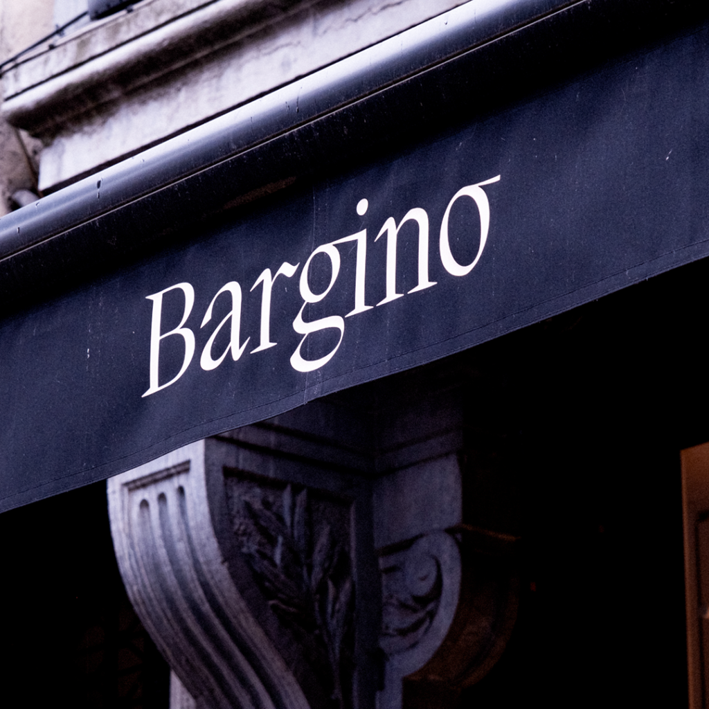

Create flexibility with a pattern
With a bold, eye-catching pattern, we add versatility and flexibility to branding. Ideal when branding is allowed to really stand out, such as for packaging materials or facade signage.

Corporate colors with Italian feel
The corporate colors also nod to Gino's origins. The soft interpretations of iconic Italian flag colors completes the experience. The combination of the letter logo, symbol and colors leads to a brand identity that evokes a luxurious, exclusive feeling.