Coerant


Accountancy, but different
A great accountant doesn’t just focus on the numbers, but also on the people behind them. That’s the philosophy of Kurt and Stefanie. After long careers in the industry, the couple decided to strike out on their own and start a deliberately small-scale firm, with plenty of room for people and the challenges they face along the way.
Our copywriter got to work on the brand name, and Coerant immediately struck a chord. It merges two ideas that are inseparable for Kurt and Stefanie. Coeur, the French word for “heart”, reflects how they work. They don’t just look at their clients’ balance sheets, but also at the people behind the figures. Courant, a financial term referring to something that is constantly moving, reflects how they think. Because good administration never stands still.
As a brand name, Coerant sets the tone for a warm, approachable and decidedly non-corporate way of working. A solid foundation for the rest of the communication.


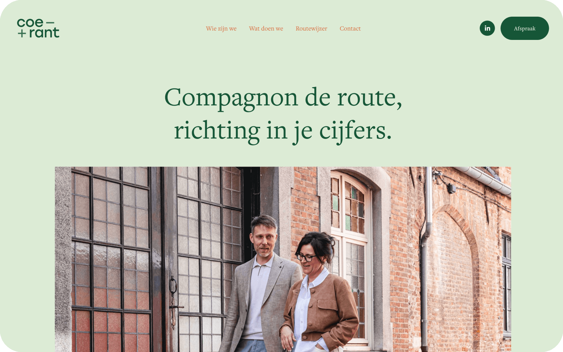
Compagnon de route, clarity in your numbers
Next, we developed the baseline and brand story. The focus shifted to the accountant as a partner in crime for their clients, a trusted companion walking alongside them on their journey. Kurt and Stefanie’s way of working was distilled into a few clear core values.
The visual identity combines fresh grass green with a deeper moss green. An anchoring orange and an elegant typeface add maturity to the brand. Our in-house photographer also stepped in for the portraits. We stayed far away from the stereotypical office setting and headed into the charming streets of Bruges instead, for a walk and a good cup of coffee.
Finally, we built an intuitive website. With a clear explanation of the who and what, Coerant now communicates its identity clearly online. Booking an appointment is easy through the contact form, and with tips for entrepreneurs and industry insights in the “Roadmap”, the website became richer in content too. Ideal for both SEO and GEO.
Today, clients and prospects recognise Coerant through a distinctive visual, verbal and strategic identity that reflects the heart of its founders.